windows 7 mspaint - the horror, the horror

mspaintW7annot

Friends and longtime blog-glancers know I like the old, early '90s version of Microsoft Paint called Paintbrush (originally made by a company called Z-Soft that Bill Gates bought) and only tolerate the supposed improved version, called Paint or MSPaint. Now it's been improved again in Windows 7, meaning they tried to make it more like Photoshop. A few quick notes:

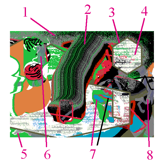
1. The "spraycan" tool still looks like a miserable bee-swarm.
2. You can still do the MSPaint secrets Travis found, such as holding the shift key while dragging a pasted area to make a quasi-brush. I can't verify whether fattening lines and selected areas can still be done using [Ctrl and Numpad +] because my netbook with W7 has no number pad.
3. Some new mostly useless polygon shapes are available.
4. A limited palette of hideous Photoshop filter-like textures is now included, such as this "crayon shading" or whatever it's supposed to be.
5. A new selection of brushes that imitate watercolor strokes has been added. These automatically anti-alias when you release the click, so they look nice and smooth at the edges. Unfortunately when you use a fill color the anti-aliased area shows up as white! Nice going, guys.
6. Some transparency is available in the new "soft" brushes." This might be useful but all subtle gradations are lost unless you save to .png.
7. The old pencil tool can still be used to outline and fill, to prevent the problem described in #5 above. The pencil now has more line widths, as seen in the example. Still need to test if this can be fattened further using [Ctrl and Numpad +].
8. Even if the washy effect of transparent brushstrokes is lost on saving to GIF or BMP, having the ability to "bleach" existing colors might be good--need to play with it more.

All in all, still a crap tool, now with features lifted from the king of crap toolmakers, Adobe.

go, daddy (barbara kruger online)

barbarakrugerdotcom

Found here on Feb 17, 2011.

Best known for her layering of ironic red and white captions in Future Bold Oblique font over black and white stock photos when she virtually defined the art world of the 1980s, Barbara Kruger has somewhat dramatically shifted her style in the Net Era. Her recent work imitates the lowbrow styles of parked domains and pharmaceutical ads, exposing the masculinist codes of current web design: for example, employing a "babelicious" female in a traditionally macho profession such as race car driving to serve as a spokesmodel. For Kruger online discourse is a Freudian joke, as seen in the above piece titled "Go Daddy" (2009), which mimics an expired Barbara Kruger domain.

Yes, That Donald Judd

m1nim4lism_1

A few months ago was having a conversation about the '60s and someone said "but it was really only Andy Warhol who marketed himself both in the fine art and commercial realms." I said no, many more got bit by the bug, even Donald Judd, who appeared in Harper's Bazaar posing with a woman wearing a "minimalist dress" (his wife at the time, dancer Julie Finch) and famously sold "art furniture." Found the pic in question on the, um, internet: look and weep, all you who might think Judd was a stern mandarin figure aloof from the process of mass media promotion, alone in the studio with only a T-square for company. Here he is, "workin' it." (The green stripe is a scanning error, not art.)

hat tips Bill Schwarz and James Meyer

10th Anniversary (2 Days Ago)

1298407548566-dumpfm-carjackcker-Screen-shot-2011-02-16-at-2.49.59-PM

Somehow I let my 10th anniversary as a blogger go by--my first post was February 21, 2001. Now I'm so well known that people are making screen shots of my typographical errors (above: .png by carjackcker posted to dump.fm)*.

Thanks to Bill Schwarz for hooking me up with my first blog and to Jim Bassett for keeping Digital Media Tree running smoothly all these years. And thanks to Barry Hoggard and Edward Potter for helping me with the Word Press phase.

Waxing philosophical: This blog is a relic of the heady "blogosphere" days, before Facebook made the Internet safe for everyone. My intent is to continue as a Coelecanth-like living fossil (minus comments), while trying out various corporate and indie social media playgrounds other than Facebook, which just sounds sucky.

*And not just making screenshots - hotlinking them and pairing them with dead guys.

Umbrico in situ

umbrico

screenshot - detail of post on Vvork re: Penelope Umbrico

Captured on 1280 x 1024 screen (the last square aspect screen in existence).
The reason people want nice, regular corporate social media sites is so this kind of chaos won't happen.
The design team will resize your images for you and make sure they stay within layout boundaries

See previous post. The vastness of Umbrico's project (aggregations of photos on storefront windows) is conveyed on the internet by having a jpeg 2000 pixels wide that necessitates side to side scrolling and penetrates other content on the page.