frames from lou's pseudo 3D page (hat tip roy stanfield)

Time Out New York reviewlet:
Marvelli Gallery
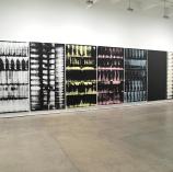
Skyler Brickley, “Wall-to-Wall”
The digital is rendered with a gestural touch in these large-scale paintings, which, hung together, constitute a chromatic environment within the gallery.
Two missing words: Andy Warhol. But seriously, these paintings grow on you after you stand in the gallery a while. Two artists from Texas, John Pomara and Tad Griffin, have done similar work: their paintings have more tasty and considered surfaces but don't attempt the ambitious wraparound environment Brickley's show does. Not sure how much "the digital" really has to do with this project--it could refer just as much to xerography and Muybridge. Possibly there's something in the back story of the artist's process but it seems more likely the reviewer wants to make the work sound current by invoking 0s and 1s, even though this is old fashioned smeared/squeegeed paint on canvas. (Some screen printing might be involved--would have to delve into it more--but nothing resembling ink jet or other digital printing a la Guyton/Walker.)

Art critic Joseph Masheck puts Josef Albers' 1960s record cover designs in context in an essay for the Brooklyn Rail:
Almost all were done for Enoch Light (1907-1978), a classical as well as “easy (all too easy!) listening” musician and techie hi-fi fanatic. Light was the mover behind both Command Records and his own performance group, the Light Brigade, which specialized in music often built around an instrument I as a youth hated even more than muted trumpet: the vibraphone, with its nagging call to bop cheerfully along. There’s something lily-white about it too. Anyway, middleclass culture has limits that Albers managed to live with without evident compromise on the art’s part. After all, Rembrandt too paid the rent by purveying graphics to the middle class. So instead of describing the covers in the kind of detail that we would probably not even want to devote to seven Albers “Homage to the Square” paintings, I’ll comment on some cultural connections that they make for me —connections of a kind usually provoked only by fine art. (I have been told that the jacket designs make no attempt to caricature the music.)
Was a bit relieved to read this after the Minus Space press release announcing its show of the covers, which described Enoch Light as "a classical violinist, bandleader, and sound recording engineer" without any hint that he was a known schlockmeister. The slide show accompanying the press release gives a good overview of the exhibit (closing Jan 30), which includes other period jacket design along with Albers' rather slim output (seven covers).
Masheck, who was editor-in-chief of Artforum in the late '70s and now teaches art history at Hofstra, actually critiques the covers!
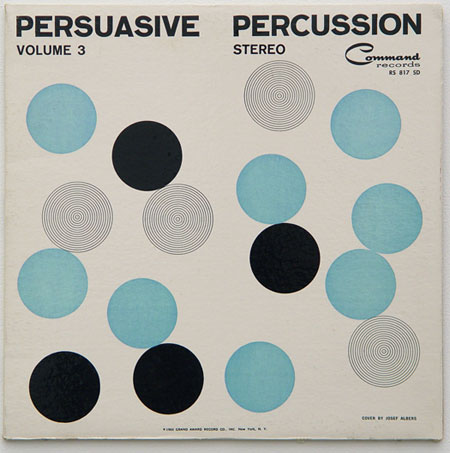
Persuasive Percussion (1959; in this case not the Light Brigade but Terry Snyder and the All Stars) shows a tightly packed grid or lattice of small black disks from which a few wander up and out like stray molecules of some light gas; or better still, like the diagrams from a classic essay in which Cyril Stanley Smith would show how natural lattice structures are surprisingly tolerant of irregularities (“Structural Hierarchy in Science, Art, and History,” 1974-75, 1978). Persuasive Percussion Volume 2 (1959) features a Judd-like stack of short green horizontal stripes down the center, asymmetrically punctuated by black disks. Then Provocative Percussion (1960) is Lissitzky-like with its larger black rotated squares and single smaller ones. Provocative Percussion II (1960) has smaller and larger disks, bobbing about singularly and paired in the field, very much like the red disks in the paintings of Paul McMahon (as in The Pictures Generation at the Met last spring and summer). Another cover with an evenly spaced lattice of dots, Provocative Percussion III (1961), has exceptions of different sorts, with some dots lighter, some darker, and others missing, resembling the spots of an LED sign, which help it appear pleasantly loose and improvisatory.
And concludes:
This short-lived project was not like Rodchenko doing candy wrappers with Mayakovsky writing the label copy, because the albums weren’t supposedly of “low” music, though from the avant-garde point of view the middlebrow is often more aesthetically objectionable than whatever is authentically low. Well, even as to musicality: one has definitely heard worse. Here Albers was doing a job, and took it seriously. At least he wasn’t doing a number.

Cropped frame from a video work by Artie Vierkant, Exposure Adjustment on a Sunset, 2009. A 35 minute real time video of the sun going down over the ocean gradually breaks up as the camera's "exposure adjustment" algorithm struggles to keep the light constant in an image that is fading to black. What should be a calm bath for the eyes becomes increasingly, violently agitated--an accidental psychedelic light show.*
This video is recommended to anyone who uses a digital zoom or similar enhancement features in a camera: it's a Dorian Gray portrait of that pretty, fake image you are presenting to the public. Instead of the aging in the Gray painting, Vierkant traces the bicubic corruption inherent in attempts to stabilize a changing reality. Paradoxically (and unlike the Gray), the digital noise is ultimately more aesthetically pleasing than the postcard sunset.
See also: Joe McKay's Sunset Solitaire
and Jonathan Horowitz's Maxell.
*The still came from a Vimeo version--the softening of pixel edges from saving it online is a whole other degradation topic.