last sculpture post for now

gutnov_et_al

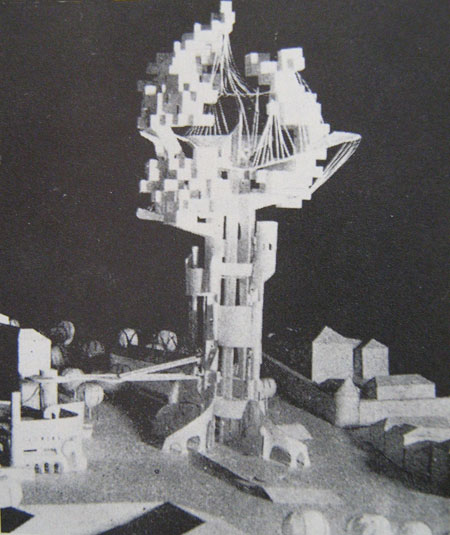
Above, another image from the wannes deprez/ony one flickr stream: A. Gutnov, V. Iudintsev, E. Rusakov, Scheme for a tower on Trubnaia Square, Moscow, 1970. This looks like something from the 1920s rather than 50 years later. More of that crazy Soviet-era architecture that's gradually getting wider views thanks to the WWW.

stanfield13

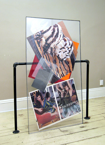
Completely unrelated except in some vague rhythmic sense, a neo-Rauschenbergian photo-combine by Roy Stanfield. (Actually it's way more elegant than anything Bob ever did.) From Stanfield's website, which is now a daily, single image archive. He also designs artist and gallery websites, so throw him some business.

Daniel Widrig and Shajay Booshan

widrig_booshan

binaural, a sound-based data sculpture by Shajay Bhooshan and Daniel Widrig commissioned by Melkweg

Frozen: Sound as Space exhibition, Amsterdam, July 2008, curated by Marius Watz.

Haven't seen the piece, only jpegs from various angles. These sculpture posts are more in the nature of thought experiments than art reviews. What do the images of the sculptures say to a working artist? Would like to see this piece/image have some of the obsessive/creepy personalization of say, Cathy de Monchaux, or the sense of accident or catastrophe of the Kai Vierstra Earthquake piece posted earlier. The idea of sound visualized as pure form is nice and the execution is tight but art is more than that. This is a complaint about generative art generally. Even though the computerization tools are new, we've been there with this kind of modernist sculpture. At its worst it's a kind of kitsch that you saw a lot of in "happenin" '60s/'70s churches and synagogues. At its best it does exactly what it's supposed to do--visualizes sound waves, in the most formally pristine way. Again, we need more.

Kai Vierstra

earthquake_vierstra2

earthquake_vierstra1

Kai Vierstra - Earthquake with Large Fissure

Video of similar piece showing plywood being stressed and cracks forming:

vierstra_video

[Quicktime .mov] - dead link, try the vimeo

[jpeg and video review--haven't seen the actual work] The slow cracking of the wood in the video is aesthetically satisfying, like the popping of bubble wrap, but ominous. I like the piece's encapsulation of horrific forces into almost-pure form. The shape seems to have been determined entirely by factors other than the artist's design: an imagined civic architect's ideal plans twisted and rended by catastrophe "in the field." It's straight-up entropy--once broken the structural integrity is gone. Compare Steve Parrino's bashed-in monochromes and Jason Middlebrook's post-apocalyptic Bilbao. Or Gehry if all the "implied torque" in his buildings actually tore them apart.

Double Happiness at vertexList

double happiness 1

double happiness 2

double happiness 3

Their installation in a group show called "New Blood." The DVD cases are Nigerian and Thai cinema, mostly. One video was still rendering when I arrived so I didn't get a shot of it (just the default JVC screen with colored spheres). The snack station features a working refrigerator and microwave and gallerygoers were heating mini-pizzas (also note Hydrox cookie bag--there's a story involving Warren Buffett and the reviving of the brand after he received a letter from the group--they may be heroes). The scatter-orgy successfully translates the maxed-out, unrepressed, multiple-overlapping-media vibe of the group's blog. Taste and restraint are concepts they have no use for, making them the most lifelike of the surf clubs.

Note: two members of Double Happiness will give a presentation about the grocery store C-Town (Town-Town-Town...) in connection with this year's Conflux Festival. Details at the link.

Another note: barely visible in the top photo is a laptop "eating" slices of actual pizza, which may or may not remain for the duration of the exhibit.

Matt Shlian - Questions

matt shlian

Lee Arnold finds this nugget (and others) at the SIGGRAPH conference [via the vertexList blog]:

Matt Shlian was at the conference as an artist in residence. He gave a fascinating talk about his intended misuse of technology to create paper sculptures and drawings. The work above was created with a digital plotter printer in which Shlian replaced the original drawing implements with Sharpie, ballpoint pen, and pencil.

Looks good. Would like to know more about the imagery, though. Is appropriated/scanned? Drawn by the artist on the computer? Based on a generative algorithm? The "misuse" of the printing tool is great, but one wonders if that same philosophy of misuse extends to the creation of the imagery somehow. Are the various low-tech writing implements causing the drawing to fail in some way (i.e., be imperfect or incomplete)? These look like contour drawings of architecture made with eyes closed--are they? The "timbres" are nice, balancing the machine- and handmade, but it would also be nice to know that it's not just an illustrational "look" that a web startup could use to make its style more "grunge." Is it possible to make bad (non-tasty) drawings with this method?