Hand Drawn Album Covers

Hand-drawn versions of classic art rock covers by Travess at Loshadka:

My Bloody Valentine Loveless (woodburning kit? and ink, looks like, really nice)
Hawkwind In Search of Space, crayon or colored pencil and MSPaint (or equivalent, for the black background--I don't know what I was thinking when I deaccessioned that disc years ago)
Steve Hillage Fish Rising (nice to see ol' Steve getting some fan recognition--he suffered horribly in the rave era with Simon Reynolds repeatedly calling him out as an ancient prog rock bore; I mean, it's not like he didn't do some pretentious work but he has played with everyone from the Egg guys to Daevid Allen to Malcolm Cecil of Tonto's Expanding Headband to Derrick May--at some point it has to be acknowledged that great musicians like him)
Pulsating Pixel Grids

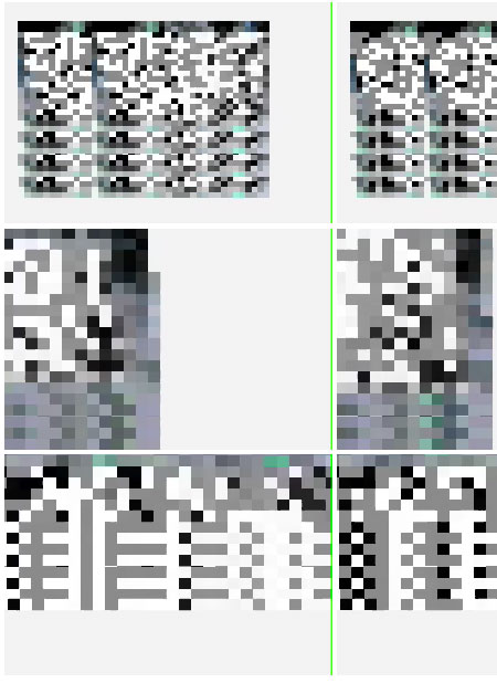
petra cortright horizon trackx

Petra Cortright, "Horizon Trackx"

In this rather stunning grid of Quicktimes from a larger project (above is a cropped screenshot of the page), artifacts from a rotating plane are enlarged, cropped, and presented side by side in multiple views, dissolving into randomness while suggesting larger things going on. Abstraction's ability to create a screen for projection and imagination makes it an exciting place to be working, as opposed to all the algorithms-with-obligatory-"political"-backstory that comprise so much XYZ new media art. It is not "formal"--one seriously doubts Cortright cares about practical Bauhaus laws of pictorial organization as ends in themselves; those are problems for the designers of the programs she uses. In fairness, the Quicktimes above occur within in a larger project that explores the dismantling and layering of built space(s), but the "big picture" is equally tantalizing and puzzling. The index for the entire piece is here.

data diary - arcangel

Cortright's work echoes Cory Arcangel's "Data Diaries" project (screenshot above), and the flow of pages feels diaristic, but in Arcangel's case the flickering, seductive grids sprang from a paradoxically rational, deductive method--tricking Quicktime into reading a home computer's numeric (alphanumeric?) memory as images. Cortright's work is a more deliberately expressive and conscious page sequence, with each causal transformation yielding some new spatial contortion. Both bodies of work have the feeling of spelunking inner machine space and discovering a boundless world.

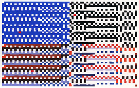
galbraith

Another variant on the "pulsating pixel grid" is David Galbraith's work at Diapason (detail above scanned from ink jet print). Haven't seen it in person yet but it sounds intriguing. Like Arcangel's piece, which whirred and screeched like a CD-scratched fax machine, it has an audio component, in this case lock grooves triggered by the pixels:

lgOpre (luh - GOP - ruh)* is an audiovisual installation of multichannel sound and projected digital animation created with real-time software that links vintage grid pattern algorithms with vinyl record lock-groove samples. The software behind lgOpre, written by the artist, uses customized abstract image generation routines (c.1970), appropriated color schemes, and self-similar number patterns to create an animation that is also a visual controller for a modular digital sound studio. Each of the 34 grid pattern building blocks used for lgOpre is mapped to its own set of processed and unmodified lock-groove samples. The color of the underlying grid is used to select which sound will play as the basic grids from each animation frame are visually highlighted in turn for a determinate duration before advancing to the next frame. Aleatoric color scheme variants introduce a degree of chance to the sound-image mapping.
Compositionally, lgOpre first introduces each visual building block as a full-screen matrix using black and white, grayscale or a few saturated colors to create monochromes or relatively simple patterns accompanied by solo sound samples. The screen splits in half horizontally, then vertically, producing four quadrants with increasing pattern complexity. New color schemes and faster sequencing within a single animation frame trigger the look of blocky color video games or visualized computer core dumps and densely layered multichannel sound.

*locked groove Open research.

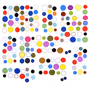
Update: Another treatment of this theme comes from the perspective of appropriating pop culture and/or pseudoscience: Robert Wodzinski's animated gif made from 100 found color therapy swatches.

Update 2: pierre has a post about generating pixel grids [update: dead link], coming from a set theory perspective; he sees it as a diy project in computation rather than as an art project, per se, although the resulting patterns are nice to look at and certainly have some connections to gridmeisters John Simon and Manfred Mohr.

Glenn Rubsamen

Glenn Rubsamen

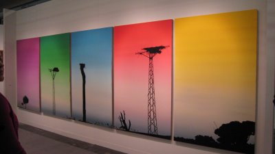
Glenn Rubsamen's work at the Armory show. Photo from Oly's Musings. Olympia Lambert says this about the work:

In yet another example of color saturation, Glenn Rubsamen had a wall devoted to his cell phone towers that appear to be on first glance palm trees. Again, it's Southern California at its most decadent candy coated shallowness. The gradient skies seem to float amongst the bird nests attached to these manmade structures that are so foreign to the natural make up of the land. These are great references to Pop art at its finest. Seeing how corporate America continues to market to us an ever greater need for 24-7 communication, we are forced to disguise these very technologies in our communities. Sticking out like a sore thumb amidst an arrid landscape, the works are interesting in how they capture the nature of communication now. Regretably, it all comes down to 0's and 1's, but a sunset, dusk, or sunrise will always capture a moment that cannot be quanitified in a digital readout.

Rubsamen has been making very similar paintings for years--trees, lampposts, phone poles silhouetted against gradient skies, always immaculately painted. The cell phone towers are a new wrinkle but it seems like these creepy sentinels always belonged in his paintings. Not seeing these in person is one reason to regret not attending the Armory.

The Rematerialization of Art

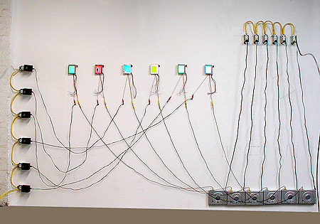
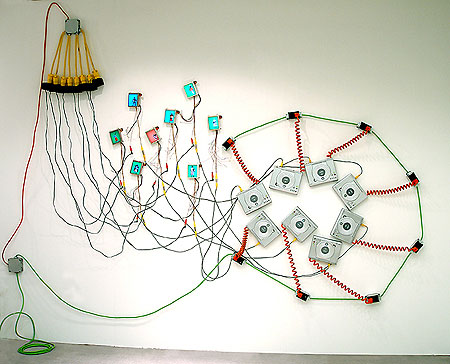
In Ed Halter's formulation [Rhizome link changed--see below]*, as the world becomes more awash in abstract data, Net artists are reifying their formerly ephemeral work and paradoxically diving into the commodity stream. But what to do with all that hardware in the gallery? On one side of Michael Bell-Smith's recent Foxy Production show cables from computer screens were discreetly attached to the wall, taking the shortest possible distance to the Mac Minis hugging the floor and trying their best to be invisible. On the other side of the gallery the wires were tossed around with Cy Twomblyesque abandon. Which brings us to the Baroque phase and Ray Rapp's work, below. This needed to be done and the gesture to be noted--this is where rematerialization leads, with a "hyperrealized" vengeance.

rayrapp_6inrow

rayrapp_installCru

digital video wall drawings by Ray Rapp

Please note that neither sales nor selling have been discussed so far. Halter's rematerialization rhetoric is old news in the art world. The '80s was all about a "return to painting" after the conceptual experiments of the '70s; like Halter, critics came up with a term to defend a retrograde practice. Back then it was commodification, supposedly a Marxist critique of what the galleries were doing--making bushels of money--that was more of an ironic celebration.
A "net artist" joining a gallery stable merely revisits, say, Jenny Holzer's transition from a "relational" artist tacking up her truisms on New York phone poles to an internationally-feted mega artist using increasingly bombastic (and highly sellable) LED displays (similar to corporate stock tickers).
The rematerialization part isn't new and the sales part isn't interesting.
After the Halter thread on Rhizome I had a phone conversation with Aron Namenwirth of artMovingProjects, where I've been showing work. He's been mixing media and non-media in his gallery, and felt the reason for materializing art (forget the De- or Re-) was to get it into a public space where people could look at it, hear it, and talk about it. When we were doing the "Room Sized Animated GIFs" show and the BLOG project space we were talking mainly about how to translate theretofore privately-consumed Web work for a "commons" where people would be walking around and presumably would not want to be bored. Believe it or not, some people have a jones for a white box space and seeing what happens in it. Doing the shows required a hybrid thought process of thinking about what was important online and what was important in meat space/meet space. Yes, we talked about the f*cking sales process, a necessary part of keeping the gallery doors open, I think, but the excitement of the shows was, um, the shows.

*Update, 2011: The Rhizome link has been changed to http://rhizome.org/editorial/2008/apr/1/the-rematerialization-of-art/