Sharp Pixel Lament

Have continued the process of manually enlarging animated GIFs that rank and file browsers no longer size properly. Redid about 40 in all; it is now possible to page back through my old animation log (if you are feeling bored/insane) and not encounter any tastefully fuzzed out pixels. (This wasn't all pointless labor--I learned some things in the process.)

As explained here many times, there are two main types of images on the web, graphics and photography. When you scale up a photograph (with an html command to make it two times larger, say) you want it smooth, not full of jagged pixels. Graphics are different: if you have a blue square that's 100 x 100 pixels the browser can tell it to be 400 x 400 and the edges stay nice and sharp. No resampling or filtering computation is necessary--the blue just spreads out to a larger surface area and stops at the same clean line--very efficient, very ecological.

Up until this year, most browsers assumed the main content of a web page was graphics. Now, with Firefox 3 and Internet Explorer 8, the assumption is that everything is a photo. So anything enlarged or zoomed by the browser will be "anti-aliased," or tastefully fuzzed out. This means all the formerly sharp graphics enlarged with html commands get treated like photos, i.e., the "vaseline on the lens" look. That totally blows the desired effect of some "internet art" conceits, which were to put it simply, creating mini-Mondrians with blown up, formerly invisible pixels interacting with whatever content already existed.

The real pain (as in throw up your hands and go do something else) will occur when the nerd authorities (with Adobe calling their shots) decide that GIFs are a silly old file type and browsers no longer need to read them.
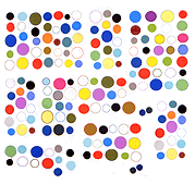
Notes on Morton Subotnick's "Until Spring" (1976)

A 29 minute piece that Subotnick describes as an audio sculpture, divided into two parts in the vinyl version.
Modular analog synth and 8 track analog tape.
Clean recording--all the elements can be heard and "seen" in the stereo field.
Pre-recorded snippets arranged in time and also across the space of the 8 tracks.
Both dimensions are depicted in drawings on the sleeve--curlicues, arcs, hatch marks, and elongated > and < signs, in a kind of cloud as well as the 8 track "staff." The overall dynamic: alternating slow and fast passages; a thinning and thickening of sound. The elements, or snippets, include: A staccato wap-wap-wap that speeds up to a high purr and pans slowly or rapidly in the stereo field. Slow hums building into a rapidfire sequence of boings (with varied attack/decay envelopes). Some low-pass filtering of these segments. Lawn mowers in the distance and summer sprinklers right next to your ears.

Mini-Greenbergs

Express any opinion other than "it's all good" and you will be called Greenberg.

You could probably surf around and find bloggers arguing for a "high art" that shouldn't be mingled with low. Anyone with less writing skill than Clement Greenberg is going to make that sound pretty pompous and "out of it," at this point. Even Greenberg admitted in his later years that kitsch had gotten better in the decades after he wrote his essay "Avant Garde and Kitsch."

Artists need their straw people, though: an entire generation ascended in the art academy rebelling against Greenberg's purist ideals of non-commingled art forms. Without his strong spine the culture of rebellion falls apart into semi-articulated cults. So it becomes necessary to perennially construct mini-Greenbergs: imagined foes of low culture who can be shot down.

Thus, if you say this or that artwork or expression is bad, you are presumed to have a rule book in your head and it must be as authoritarian and ascetic as Clem's was. That you might be arguing contingently and with as much guerrilla purpose as the so-called rebels is not considered--you have overstepped.

A good academic post-modernist works by stealth. Never stating anything publicly that suggests that a work is "good" or "bad" but maneuvering behind the scenes to advance a canon based no less on personal taste than that of the loudmouthed Greenbergs-of-the-moment.

A bad academic post-modernist (which is to say a good post-modernist) attacks if necessary, sacrificing near-term status and bonhomie with colleagues by acting as a pre-emptive false Greenberg. In the belief that stating an opinion is better than lying back and sniping. A canon of a different sort will emerge: one based on considered judgments of individual expressions (high, low, or indifferent), with the apparent inconsistencies ironed out over time.

Straw Man

Something I wrote in a snit a few years back: "Marketing culture wrecks everything it touches" (after encountering Harry Nilsson's song "He Needs Me" in a mawkish Nike commercial)

is being construed by an Internet interlocutor as

"High popular art must never cross the line to be used in low popular art contexts" (a paraphrase but I think that's the gist).

"He Needs Me" worked ironically in Altman's Popeye when Shelley Duvall sang it about wifebeater Bluto, and it worked in PT Anderson's Punch Drunk Love when sung over shots of Adam Sandler as a more contemporary rageoholic. It did not work as an anthem for a school girl's ordinary crush on her tennis coach.

Somehow saying this has been translated into "drawing a hard line" between high and low Pop (whatever those are). That was not my meaning. Dissing commercials doesn't necessarily mean proclaiming anything as "high" or claiming that it's inviolable. By and large commercials do suck--few dispute this. It's more a question of honesty than aesthetics.

Computer Art Competition Dream

Dreamed I was in a room with Guthrie and some other people showing artwork back and forth to each other. I was showing how certain things looked printed out (can't remember what). Guthrie blew everyone away with this animation he'd found. It was this morphing plane piece twisting around in 3D space. Inside one of the planes, moving independent to the other movement was a line of scrolling text from an art professor telling the student to do better work. It was impossible to tell if the professor had inserted the text into the student's piece to show his superior skillz, or if the student had taken an older work with the prof's criticism and mutated it up several levels to show his own superior skillz. Everyone laughed and said wow when this animation was projected.

Not that this looked anything like it but I probably had it on my mind.