by Tom Moody
The following interview was conducted online [using blog comment software], in connection with Featherly's painting exhibit at Team Gallery, New York, March 22, 2002. A shorter, related essay appeared in a brochure published by the gallery.
TOM: Over the last few shows you've been concentrating on different facets of what I would call the "super-eclectic" paintings you debuted with in 1995. The hard-edged element became one body of work, the clip-art-style imagery another, and now you seem to be exploring the "brushy abstraction" that (as you mentioned to me during our studio visit) people forget was also in those early paintings. But at the same time, the new paintings seem to be a much more intuitive, less controlled way of working. Is the new work a decisive shift from what you've been doing in the past?
JACK: A major visual shift, yes. Although the work is close to the "ray" paintings I was doing in '99 with respect to a sort of unknown sourcing. I think it's a hybrid of the two scenarios you mentioned. There is a connection to the early work but it's a conceptual one.
TOM: Before we talk about the "ray" paintings, let's go back to those early, "eclectic" paintings. They consisted of layered, appropriated imagery somewhat in the Sigmar Polke/Lari Pittman vein but with a much more high-gloss feel and succulent application of paint. I hope you don't mind my digging into your sources for those paintings a bit. Abducted at Thunder Falls, 1995, for example, featured an Asian cartoon reminiscent of a ukiyo-e print, pixelated images resembling Lite Brite pegs, and a profusion of flowers, all floating over a green and black gesture painting.
JACK: Imitation Lite-Brite, yes. I wanted to suggest the level of maturity of a doomed young girl as well as reinforce the idea of a foreign place (as in being on a road trip). The cartoon scene is from a comic book with a ukiyo-e format for the frames. I used "images from the floating world" for several years as a way of commenting on ideas of painting and theoretical space and how we connect the two. That the imagery was always from Japan was ironic, putting a level of displacement between the viewer and the idea by shifting the cultural reference to a non-western one. The flowers and plants are hand-painted because I wanted to eliminate the printmaking element and "lush" up the whole thing.
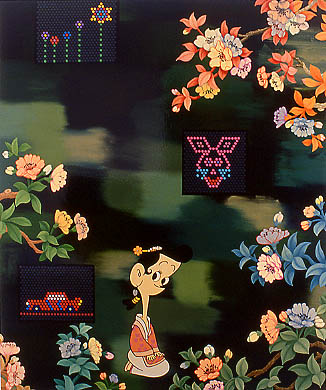
Abducted at Thunder Falls, 1995, oil, ink, plastic on canvas, 72" X 60"
TOM: Another painting from that time, Creepy, 1995, featured stylized trees that reminded me of '60s magazine illustration (either the New Yorker or Highlights, I'm not sure which).
JACK: That's from a small series of paintings I did from one childrens book dating from the late '50s or early '60s. The trees are a collection of all the background trees in the book. I was always looking for an excuse to diffuse the literalness of the images, to make abstraction.
TOM: And then, over the next couple of years, the paintings did get much more abstract, without losing the appropriation element. The work from around '97 recalled Olympics posters and supergraphics. Is that what they were?
JACK: As I moved away from imagery I looked for ways to keep my paintings grounded in reality. I've always had an aversion to the pure plasticity of most abstraction. This group of paintings has some references to winter sports but are more about ideas of television programming and the way it impacts one's life.
Well, actually there was a twofold purpose with these. The base abstraction of these paintings was the designs from the backgrounds of packaging: the interlocking chain or DNA strand in Olympic Special, 1997 (below), for example, is from the Oreos packaging of the time. The thought was to unearth the low frequency emotional ties to advertising design by using the literal background noise in conjunction with other like forms. Another level of TV information these paintings share is some form of letterboxing.
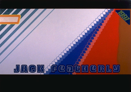
Olympic Special, 1997, oil, enamel, and liquid plastic on canvas, 60" X 84"
TOM: I read recently in Slate that mainstream TV shows like ER are now using letterboxing to make the shows seem more "classy"; Roland Barthes would probably have had something to say about wasted visual real estate connoting "class." Returning to the "ray paintings" you mentioned before: were those the pieces you showed in 1998 at Team, which several critics described as "color field"?
JACK: Actually the '98 paintings made up the show previous to the "ray" paintings. I suppose color field is an apt way to describe them. I wanted to fuse a sort of ghostly idea of '60s painting with some design effects--not that these two things hadn't already been combined in numerous ways over the last 25 years--to the point where the specific design reference, which almost every painting in the series has, becomes irrelevant.
But there was a specific physicality to those pieces dictated by the regular, directional stroking of the oil paint. They were the first non-glossy paintings I'd made and I was really trying to exploit the feeling. The idea was to work with the associations of emotional transcendence attached to color field painting, whether real or taught, and squeeze them down into highly personalized moments. Whether those moments were real or not was the hidden agenda. That's why there were no individual brushstrokes; that would have allowed the viewer to potentially be off the hook by focusing on the traditional emotive device within abstraction.
TOM: In the 1998 paintings, such as Condor (below), you stripped out the signature and other typography and stopped using the liquid plastic coating. They essentially had two layers: the smooth, gradual stroking you mentioned, playing off a hard-edged pattern or design, creating what Tim Griffin called "formal disjunctions." I didn't realize the hard-edged layers had specific design references. Some critics mentioned corporate logos but didn't get much more detailed. I know you're saying that such abstract motifs have become generic (I thought of that series as "airport lounge abstraction," Steve Mumford called it "Kenneth Noland as a sweater line"), but could you give a few examples of what you were appropriating, or looking at in that work?
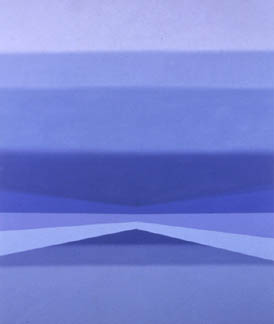
Condor, 1998, oil on canvas, 72" X 60"
JACK: I guess it is of some interest. All the graphics in the "field paintings" were culled from various racing car schemes for that season. NASCAR was the favored target because of the abundance of choices, but also because it offered the highest danger factor in terms of being "discovered." I loved the irony of using something that is visible almost 24 hrs a day, but ignored by my primary audience. The art world tended mainly to see the projection of art history buried in this mass market visual flamboyance. Of course I changed the background color for the fluffed bands, but the graphics were for the most part exact.
TOM: Then came the "ray paintings" in '99--such as High Plains Drifter (below). You mentioned that the sourcing was more "unknown" than in the '98 work, but I have a hard time seeing much distinction between the two groups of work. Is it because the rays were "made up" as opposed to appropriated?
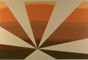
High Plains Drifter, 1999, oil on canvas, 54" X 78"
JACK: Well, High Plains Drifter is a poor example for this discussion because it evolved almost directly out of Condor. It was from playing with the idea of "bowties" of transparent color floating out of place that I started to think about the negative spaces and how to exploit them. In some sense the "rays" are like the "bowties" completely pinched and multiplied. Instead of having a real world model and then disfiguring or masking it, I came around another way and filled the space how I saw fit.
TOM: In a more "hardcore" ray painting such as The Stallion (Part 3), 1999 (below), it's clearer how the "appropriated" stripes and chevrons in the '98 work gave you a vocabulary to work with, to explore weird spatial and "anti-color" properties in the ray paintings.
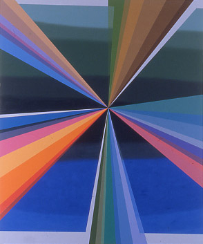
The Stallion (Part 3), 1999, oil on canvas, 72" X 60"
But as we were discussing in the studio, these were difficult paintings, in the sense of not being as "fun" as the mutated corporate graphics. They were more esoteric, appealing to a subculture of people interested in exploring "wrong" space and "wrong" color. Although your new paintings aren't based on existing logos or design motifs, they're getting fun again, particularly the most recent ones. The first paintings in the new series seemed deliberately clunky, as if you were undergoing regression therapy and trying to unlearn all your sophisticated moves, but in the pieces I just saw in the studio, there's a lot of playful interaction between the "crude" and "slick" layers. I want to get back to the "danger" element of hiding known graphics in plain sight, but let's talk about the new paintings. What led you to these, brushy, blocky forms?
JACK: I'd wanted to make a purer, more gestural form of abstraction for some time but it hadn't been possible because I couldn't get what I wanted in oil paint. Switching to enamel gave me the fluidity and the ability to make fast changes that didn't exist before. I also changed planes, going from painting on the wall to painting flat, and in a sense blind. So I focused on "feeling" the shapes as I made them, making them autonomous from the painting as a whole until it was actually on the wall. Regression is the right term, because I wanted to learn this new vocabulary for myself. I started from scratch, giving myself this big blank field of color I had to respond to.
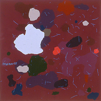
First Night Back in London, 2001, enamel on panel, 48" X 48"
I started with some fairly straightforward modernist rules: nothing goes off the edge, a general less-is-more idea about the accumulation of forms, a tease of anthropomorphism that I couldn't actually be accused of indulging in, a minimal approach to the invasiveness of the stencils, and mediation of the opposing picture planes. I wanted to capture the speed of making the shapes and have a type of expressiveness at work, but at the same time be very low-key, so the paintings didn't fall into an easy read. There's a naturalistic approach to how each shape is formed: that's where the Clyfford Still reference comes into play, feeling your way along the edge of the positive and negative space.
TOM: But as the series progressed, you began breaking your own rules. The stencils went from being "minimally invasive" to almost dominant, you began arranging the panels in diptychs, and so forth. It was if you had tried to opt out of the dialogue implicit in your earlier shows (cultural products commenting on other cultural products), but then gradually eased back into it. Of course, having said that, I suppose Clyfford Still is just as much a cultural product at this point, as ripe for the plucking as a '60s children's book. That seems to be the paradox of this new work: that for all your efforts to "purify" and introduce random variables--as you mentioned during our last visit, even the stencils are laid down using chance processes--you still end up with something that looks fairly stylish and mediated.
But that's what keeps it in play, isn't it? There are artists doing Clyfford Still today and they're completely marginalized. Which brings me to another point we discussed in the studio: the idea of making "international art objects" that are viable in terms of moving from institution to institution, from art fair to art fair. Is it possible to make those objects, yet at the same time be "naturalistic" and "self-revealing"? Since the '80s, the institutional art world has almost been premised on the notion that such expression isn't possible.
JACK: Sure, mediation and stylishness keeps it in play. I deeply distrust abstraction on that old school level, which is why I don't care about stepping on toes. When I talk about Still, I'm saying there's a correlation between what his paintings ended up looking like and the apparent process of creation. That's what I study. It's not an issue of pastiche. If this is acceptable at all, it's a deeper kind of appropriation. I would just call it internalization but there are specific people I look at and think about. Like Georges Rouault or early Joan Mitchell.
Regarding the "international art object" idea, I have this feeling that making something couched in a form of "conceptualization" is what gets the ball moving. To counter that, I try to build a system that replicates the densities of natural processes. I believe that an unflinching attempt at that can provide its own answers. Rather than concentrating on an "issue," I build layers while attempting to minimize my aesthetic input. And control things by turning over the actual logistics of the painting to layers of isolated randomness. The purer that I can execute these methods, the more sense the paintings seem to make. On paper, this sounds a little crazy, but I think it's visible in the work.
TOM: By the "conceptualization" or the "issue" I assume you're referring to the kind of intellectual one-liner that's so prevalent in the art world: an easily summarized social critique. Whereas what you're doing is creating a system where natural processes become cultural and vice versa. I agree that's much more interesting. And because you've internalized so much culture--whether through your earlier appropriation or through studying various artists' methodologies--your work is always metastasizing those elements, to use a rather fancy word.
But I'm not sure pure appropriation is necessarily played out. People may not have recognized your NASCAR emblems partly because you tweaked them, but also because sports graphics is a specialized visual language. I like the idea that our own ignorance of what's in front of us every day--because of information overload or because it's outside of our niche--makes it possible for everyday content to continually become exotic. Right now you're playing with the residue of this content--what you've internalized--but I think you have an eye for it "straight up," too. That Oreo zipper in Olympic Special is pretty edgy. Do you think that "real world" content will find its way back into the work?
JACK: Well, I think it's already there in different ways. There's a kind of uber-banality to the stencil forms in these paintings. And I'm using my name again in a way that's really consistent with the rest of the painting, rather than playing against it. In a very experimental way, I'm trying to get at real world content most directly through the palette of these paintings. I keep finding myself saying things like "this is a Lord & Taylor bag" or some other nonsense about certain paintings. And use my nose like that to sharpen a thought.
No, I don't think appropriation is over either. I have a feeling that we have all graduated to the next level of it, making it harder to identify. You just can't make art that's about appropriation. It's now a standard tool.
TOM: Let's end by talking about your use of your name in your work. I've found that the issue of signing one's work is surprisingly emotional in the supposedly blase art world: When the signature disappeared from the front of paintings in the '60s, by God, it was supposed to stay gone! You reintroduced it in '95 as a graphic element, in a quite aggressive way. It disappeared from your paintings in the late '90s, and now it's back and very much an element of the work (though not as dominant as it was six years ago). What's your position on this?
JACK: When I first started using it I was listening to a lot of hiphop and noticed how quickly I became accustomed to hearing the artist's name incorporated into the music. The song and the author became inextricable and at the same time the song retained its thematic autonomy. I was also considering how I could undermine the idea of a signature style. I thought if I could emblazon every piece with my name, I could do anything I wanted with the rest. Then I began to work in series, so that every year or so a new evolution would be there with my name as the primary thread. But by '97 I had decided that my name was interchangeable like anything else and dropped it.
After a two-year hiatus I decided the paintings were more interesting with the name so I brought it back; however, I dropped the first name and greatly reduced the scale so it was more in line with a traditional signature or logo. I've also begun making portions of it disappear and scaling it to the imagery of the piece so it hides. Like one of my favorite store names--Hides in Shapes.