from the vault: my Artforum review of Perry House, 1993

PerryHouse_crop

Houston painter Perry House died in July 2020. He had a long, productive career and will be missed. Back in the '90s I reviewed his show at Davis/McClain gallery for Artforum and later organized an exhibition of his paintings at Gray Matters in Dallas. The Artforum review appears in text form below with a couple of minor tweaks to restore my original wording.

My Gray Matters essay [PDF] waxed more enthusiastic than the one below. For the magazine I wanted to champion a Texas artist lesser known in NYC so I indulged in some procatalepsis, anticipating questions that I felt would arise in a less nurturing critical environment. Whereas catalog writing is typically more boosterish.

A struggle I had with Artforum early on was over what image to use. I had sent a print of The Curtain, The Ship of Fools to accompany the review and then someone at the magazine contacted the gallery to request additional images. Possibly the art director's convenience in laying out pages guided image choices as much as any critical judgment, but it was annoying that they ultimately ran an image of work that I had criticized! (The editor later apologized for this.)

Houston Reviews, November 1992
Perry House
DAVIS/MCCLAIN GALLERY

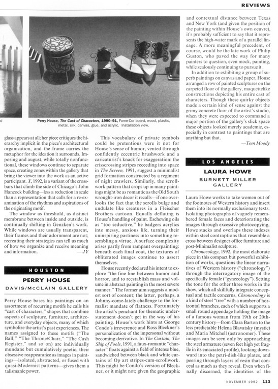
Perry House bases his paintings on an assortment of recurring motifs he calls his “cast of characters,” shapes that combine aspects of sculpture, furniture, architecture, and everyday objects, many of which symbolize the artist’s past experiences. The names assigned to these motifs (“The Ball,” “The Throne/Chair,” “The Cash Register,” and so on) are individually mundane but cumulatively poetic; their obsessive reappearance as images in paintings—isolated, abstracted, or fused with quasi-Modernist patterns—gives them a talismanic power.

This vocabulary of private symbols could be pretentious were it not for House’s sense of humor, vented through confidently eccentric brushwork and a caricaturist’s knack for exaggeration: the crisscrossing stripes receeding into space in The Screen, 1991, for example, suggest a minimalist grid formation enacted by a regiment of night crawlers. Similarly, the scrollwork pattern that crops up in many paintings might be as romantic as the Old South wrought-iron decor it recalls—if one overlooks the fact that the scrolls bulge and undulate like creatures in a Fleischer Brothers cartoon. Equally deflating is House’s handling of paint. Eschewing oils as “too seductive,” he badgers acrylics into messy, anxious life, turning their uninspiring pastiness into something resembling a virtue. A surface complexity arises partly from rampant overpainting: beneath each final coat, the textures of obliterated images continue to assert themselves.

House recently declared his intent to explore “the fine line between humor and horror, and to reestablish mass and volume in abstract painting in the most severe manner.” The former aim suggests a modest sort of content; the latter, perhaps, a Johnny-come-lately challenge to the formalist mandate of flatness. Fortunately the artist’s penchant for thematic understatement doesn’t get in the way of his painting. House’s work hints at George Condo’s irreverence and Ross Bleckner’s personalization of the impersonal without becoming derivative. In The Curtain, The Ship of Fools, 1991, a faux-romantic “character” floats against a field of intense blue, sandwiched between black and white curtains of Op art stripes-cum-scrollwork. This might be Condo’s version of Bleckner, or it might not; given the geographic and contextual distance between Texas and New York (and given the position of the painting within House’s own oeuvre), it’s probably sufficient to say that it represents the high-water mark of a parallel lineage. A more meaningful precedent, of course, would be the late work of Philip Guston, who paved the way for many painters to question, even mock, painting, while zealously continuing to pursue it.

In addition to exhibiting a group of superb paintings on canvas and paper, House arranged a row of painted sculptures on the carpeted floor of the gallery, maquettelike constructions depicting his entire cast of characters. Though these quirky objects made a certain kind of sense against the grimy concrete floor of the artist’s studio, when they were expected to command a major portion of the gallery’s slick space they looked merely academic, especially in contrast to paintings that are anything but that.

—Tom Moody

Other writing on House from this blog

from the vault: my Artforum review of Michael Smith and Joshua White (author's cut)

smith_white1 smith_white2

New York Reviews, Artforum, May 1997
Michael Smith and Joshua White
LAUREN WITTELS

In this exhaustively detailed, tragicomic installation, collaborators Michael Smith and Joshua White transformed the gallery into an office and showroom for MUSCO (pronounced “muse-co”), a once-thriving lighting business now headed for Chapter 11. As explained in a promotional video running continuously on the “sales floor,” the fictional company supplied equipment for psychedelic light shows in the ’60s, “responded to the needs of the burgeoning disco culture” in the ’70s, then adapted its products to the corporate setting in the ’80s. Sadly, items such as the “loft lamp” and “interior/exterior architectural track lighting” failed to take off, and when the viewer encountered the installation, boxes and trash bags were piled up in the lobby, accompanied by signs explaining that the company was “reorganizing.”

Despite its imminent collapse, the business was chock-a-block with merchandise (the artists spent three years on the project, and the amount of stuff they hauled into the gallery was mind-boggling). In addition to display cases full of cheesy products tailored especially for the show -- “Mood Tube” table lamps, satin Disco-Time vests -- the installation featured an illuminated “stretch sign,” a Velcro wall of bulbs, and a fully equipped disco showroom with revolving mirror ball, ’70s dance music, and a host of low-rent lighting effects. Most poignant was the MUSCO “office,” a convincing replica of those often found in small, struggling businesses, complete with grimy fax machine, threadbare carpet, and years’ worth of ephemera crowding shelves, desktops, and bulletin boards (much of it acquired from actual lighting companies, including White’s own, the short-lived Sensefex). Within this glut of detail, one could trace the history of the imaginary business’ decline, with concert posters and pinned-up business cards gradually giving way to an empty Four Month Planner and a copy of What Color Is Your Parachute? lying open on the desk.

Failure is an ongoing theme for Smith, whose video-and-performance alter ego Mike appeared in the company’s promotional materials as “Mike Smith, President and Founder of MUSCO.” With his sad features and unflagging optimism, Mike personifies the small businessman who is unaware that the greatest obstacle he faces is his own deeply ingrained mediocrity. The products he developed for MUSCO cut corners imaginatively as well as financially -- for example, a “video wall” of fake monitors slapped over a washed-out, rear-projected image -- and he lacks the vision to see the techno/rave scene as his salvation in the ’90s (according to Smith, alter ego Mike is aware of the trend but just doesn’t connect with it).

The installation became more complex when one realized that Smith’s collaborator, Joshua White, is the real-life creator of the Joshua Light Show at the Fillmore East in the ’60s. In the MUSCO fiction Joshua and Mike are partners (a doctored photo shows them shaking hands, ca. 1969), but in reality White got out of the light-show business in the early ’70s and became a successful television director, shooting everything from National Geographic Explorer to Seinfeld. Although he appears from his résumé to be a newcomer to installation, his inside knowledge of the lighting business -- and life, at least to a point -- brought layers of authenticity to Smith’s typical, total-immersion environment. One wonders what perverse instinct prompted White to envision a twenty-five-year partnership with a fictional loser (morphed into his past like a low-tech Forrest Gump), but in any event, the collaboration worked, fusing the decline of ’60s idealism and the downside of the American dream into a spectacle at once depressing and hilarious.

—Tom Moody

MUSCO

Some anecdotal background on the above review:

It appeared verbatim in Artforum's May 1997 issue except for one goof by the editor (Eric Banks, currently director of of the New York Institute for the Humanities -- more on him below), which I corrected here: in paragraph four "Joshua and Mike" appeared as "Joshua and White." Forrest Gump probably also didn't need italics (my mistake).
Several things struck me as "off" about the show that I didn't have space to develop. First, moving all this banal retail stuff into the gallery was truly a monumental effort but the illusion of an actual going business on the skids was only really maintained in one room: the carpeted office I mentioned. Elsewhere the floors were the gallery's standard polished wood, with the tasteful overhead track lighting still in place. Thus, you could never sink into the illusion that you were inside a struggling business (albeit with in-joky merchandise) and were constantly aware of the incongruity of "high" and "low" class markers -- the photo accompanying the review captures this somewhat.
A Frieze review concluded its description of the work by calling it a metaphor for modernity, in the sense, I guess, of its dazzling promise and threadbare delivery. That's a good point but, due to the incongruities mentioned above, I'm still not sure the show rose to the level of a metaphor. An earlier collaboration of Smith's called World of Photography (with William Wegman) fairly successfully laid waste to the assumptions of an entire medium (professional photography), whereas disco lighting is perhaps not as meaty a topic.
The Village Voice called the show "doubly ironic" because "it recreate[d] exactly the kind of small business that might have existed in Soho before art galleries pushed it out." Another good point, again, if traces of the gallery could have been eliminated from the recreation of the business.
Another "off" thing about the show was the nature of the partnership. Michael Smith was a well-known artist with a yard-long resume in performance, installation and video; White didn't have any art world credentials to speak of but was famous for other pursuits. Possibly after his start in providing rock concert visuals with the Joshua Light Show at the Fillmore, he always considered himself an artist, even after he left the lighting business and went and worked for The Man as a TV director. I interviewed him while making notes for the review and didn't delve into this awkward area. But in the editing process Banks wanted to know "What is White's stake in all this?", which led me to wonder the same thing in the final paragraph of the review. (I think it hit a nerve: after the review came out I met White again and got a rather frosty reception.)
Even more (cynical Manhattanite) speculation: I wondered at the time if White was a "backer" in the relationship. Smith was art world famous but not a big seller. Was White providing financial aid in exchange for a late start of an art resume? After the MUSCO show Smith and White did a few other collaborative exhibits. One at the New Museum recreating Mike's Soho loft was almost all Mike, content-wise; White's contribution was barely discussed in the press materials. The MUSCO show provided the first and possibly only valid point of conjunction between these individuals: Smith's fictional loser life and art world cred melded with White's real life business failure and possibly financial contribution as a result of later material success in corporate culture (TV).
Yet another "off" thing was the fiction of the failing business. Shouldn't the rave scene have revived it in the '90s, when this exhibition occurred? In our interview White said the collaborators had kicked around a performance idea where square retailer Mike was approached by some pierced glow stick kids and he told them to get out of the store. When I ran this by Smith he said "absolutely not -- Mike wouldn't have been hostile to ravers" and provided the quote about Mike just not connecting with that scene. (Smith's video persona may be a goofy sad sack but he has a strictly-business demeanor when talking about his character, a la Paul Reubens and Pee Wee Herman).
In an Artforum review, once you're done with the description, you have one more paragraph to sum up. Hopefully these notes have fleshed out the review (23 years later when it doesn't matter).

MUSCO_pricelist

scan of price list

Artforum review of John Pomara exhibition, 1991 (author's cut)

john_pomara_96_tears_650w

John Pomara, 96 Tears
oil and enamel on canvas
72 x 124 inches
photo: Harrison Evans
larger view

Below is a corrected "author's cut" of a review that originally appeared in Artforum, in December 1991. A post noting the changes was put up previously.

Dallas Reviews, December 1991
John Pomara
EUGENE BINDER GALLERY

In John Pomara’s paintings from the first half of the ’80s, turbulent color fields surrounded silhouetted black abstract forms, evoking robots and spaceships. The science fictional elements combined with graffiti and neo-Expressionist iconography to comment obliquely on the failed aspirations of both mid-century science (Sputnik gone awry) and the artistic would-be heroism of the Abstract Expressionists. The painterly brio of Pomara’s brushwork competed with the dopey, out-of-kilter robotic forms, suggesting a paradox -- the investment of substantial physical energy in the depiction of entropy and collapse.

As the art of the ’80s cooled down, so did Pomara’s, but without abandoning its basic themes or its commitment to paint. The entropic forms remained, but the full-spectrum color and diagrammatic scribblings of the surrounding fields gave way to starker, more subtle painterly effects. As if to compensate for the change, Pomara began to place second panels -- typically fields of dots or organic blobs -- adjacent to the figure-ground studies. On the whole, the added panels suggest a more upbeat approach to art and science than their companions do. Here an interest in investigating patterns of chaos joins Pomara’s characteristic skepticism and taste for paradox.

The new diptychs create dialogues (never simplistic dichotomies) between high and low, macro and micro, esthetic and antiesthetic. The vertical line separating each pair of panels becomes a permeable membrane allowing ideas, motifs, and colors to pass between the rectangles, unifying the paintings and subverting the usual cliches of the diptych format. Assonant and dissonant approaches to the double image appear, respectively, in two large works: Untitled #5 -- Orange, 1991, and 96 Tears, 1990. In the former, aluminum radiator paint is streaked laterally across both panels in a manner recalling photocopies or Andy Warhol’s silk screens. In the left-hand panel, horizontal bands of orange blur the outlines of a skewed, malevolent “spaceship.” In the right-hand panel, dots of orange and black are scattered across a silvery void. The two panels suggest oppositions (portrait and landscape, low culture and high, the ridiculous and the sublime), yet each incorporates formal and thematic elements of the other.

96 Tears presents a more straightforward dichotomy. The aluminum paint on the left side creates a complex, rather nasty surface of welts, drips, and over-painted “mistakes,” the perfect ground for the mutated machine forms. The leopard-skin pattern of black blobs over incandescent yellow in the right-hand panel dazzles and seduces; in fact, one almost wishes to see it isolated. A fine spray of yellow and black dots on the left side maintains an uneasy unity between the canvases.

In some ways, the paintings resemble embryonic cells on the verge of mitosis: one imagines that they could easily split into equally viable bodies of work. That we accept them in this poised state comments on our own divided loyalties: between the need for complexity and a desire for reassuring unities; between our demand for heroism and purity and our doubts that these ideals are attainable.

—Tom Moody

from the vault: my Artforum review of John Pomara, 1991

pomara1 pomara2

PUBLISHED REVIEW
This was my second Artforum review. As with the Linda Ridgway review, I didn't receive the customary writer-editor phone call so the review went to press with some confusing mistakes. In the "author's cut" version at the bottom of this post, I've attempted to fix the damage. It was partly my fault for writing a cute lead sentence about the new work followed by immediate backtracking to discuss older work; this clearly confused the editor. The solution was to eliminate the lead and start at the beginning of the work's chronology.

Dallas Reviews, December 1991
John Pomara
EUGENE BINDER GALLERY

John Pomara’s recent work may reflect a split personality, but it’s ours as much as his. In paintings from the first half of the ’80s, turbulent color fields surround silhouetted black abstract forms, evoking robots and spaceships. The science fictional elements combine with graffiti and neo-Expressionism to comment obliquely on the failed aspirations of both mid-century science (Sputnik gone awry) and the painterly heroism of the Abstract Expressionists. The painterly brio of Pomara’s work compete with the dopey, out-of-kilter robotic forms, suggesting a paradox—the investment of substantial physical energy—in the depiction of entropy and collapse.

As the art of the ’80s cooled down, so did Pomara’s, but without abandoning its basic themes or its commitment to paint. The entropic forms remained, but the full-spectrum color and diagrammatic scribblings of the surrounding fields gave way to starker, more subtle painterly effects. As if to compensate for the change, Pomara began to place second panels—typically fields of dots or organic blobs—adjacent to the figure-ground studies. On the whole, the added panels suggest a more upbeat approach to art and science than their companions do. Here an interest in investigating patterns of chaos contrasted with Pomara’s characteristic skepticism and taste for paradox.

The new diptychs create dialogues (never simplistic dichotomies) between high and low, macro and micro, esthetic and antiesthetic. The vertical line separating each pair of panels becomes a permeable membrane allowing ideas, motifs, and colors to pass between the rectangles, unifying the paintings and subverting the usual cliches of the diptych format. Assonant and dissonant approaches to the double image appear, respectively, in two large works: Untitled #5—Orange, 1991, and 96 Tears, 1990. In the former, aluminum radiator paint is streaked laterally across both panels in a manner recalling photocopies or Andy Warhol’s silk screens. In the left-hand panel, horizontal bands of orange blur the outlines of a skewed, malevolent “spaceship.” In the right-hand panel, dots of orange and black are scattered across a silvery void. The two panels suggest oppositions (portrait and landscape, low culture and high, the ridiculous and the sublime), yet each incorporates formal and thematic elements of the other.

96 Tears presents a more straightforward dichotomy. The aluminum paint on the left side creates a complex, rather nasty surface of welts, drips, and over-painted “mistakes,” the perfect ground for the mutated machine forms. The leopard-skin pattern of black blobs over incandescent yellow in the right-hand panel dazzles and seduces; indeed, one almost wishes to see it isolated. A fine spray of yellow and black dots on the left side maintains an uneasy unity between the canvases.

In some ways, the paintings resemble embryonic cells on the verge of mitosis: one imagines that they could easily split into equally viable works. That we accept them in this poised state comments on our own divided loyalties, between the need for complexity and a desire for reassuring unities—between our demand for heroism and purity and our doubts that these ideals are attainable.

—Tom Moody

AUTHOR'S CUT

Dallas Reviews, December 1991
John Pomara
EUGENE BINDER GALLERY

In John Pomara’s paintings from the first half of the ’80s, turbulent color fields surrounded silhouetted black abstract forms, evoking robots and spaceships. The science fictional elements combined with graffiti and neo-Expressionist iconography to comment obliquely on the failed aspirations of both mid-century science (Sputnik gone awry) and the artistic would-be heroism of the Abstract Expressionists. The painterly brio of Pomara’s brushwork competed with the dopey, out-of-kilter robotic forms, suggesting a paradox -- the investment of substantial physical energy in the depiction of entropy and collapse.

As the art of the ’80s cooled down, so did Pomara’s, but without abandoning its basic themes or its commitment to paint. The entropic forms remained, but the full-spectrum color and diagrammatic scribblings of the surrounding fields gave way to starker, more subtle painterly effects. As if to compensate for the change, Pomara began to place second panels -- typically fields of dots or organic blobs -- adjacent to the figure-ground studies. On the whole, the added panels suggest a more upbeat approach to art and science than their companions do. Here an interest in investigating patterns of chaos joins Pomara’s characteristic skepticism and taste for paradox.

The new diptychs create dialogues (never simplistic dichotomies) between high and low, macro and micro, esthetic and antiesthetic. The vertical line separating each pair of panels becomes a permeable membrane allowing ideas, motifs, and colors to pass between the rectangles, unifying the paintings and subverting the usual cliches of the diptych format. Assonant and dissonant approaches to the double image appear, respectively, in two large works: Untitled #5 -- Orange, 1991, and 96 Tears, 1990. In the former, aluminum radiator paint is streaked laterally across both panels in a manner recalling photocopies or Andy Warhol’s silk screens. In the left-hand panel, horizontal bands of orange blur the outlines of a skewed, malevolent “spaceship.” In the right-hand panel, dots of orange and black are scattered across a silvery void. The two panels suggest oppositions (portrait and landscape, low culture and high, the ridiculous and the sublime), yet each incorporates formal and thematic elements of the other.

96 Tears presents a more straightforward dichotomy. The aluminum paint on the left side creates a complex, rather nasty surface of welts, drips, and over-painted “mistakes,” the perfect ground for the mutated machine forms. The leopard-skin pattern of black blobs over incandescent yellow in the right-hand panel dazzles and seduces; in fact, one almost wishes to see it isolated. A fine spray of yellow and black dots on the left side maintains an uneasy unity between the canvases.

In some ways, the paintings resemble embryonic cells on the verge of mitosis: one imagines that they could easily split into equally viable bodies of work. That we accept them in this poised state comments on our own divided loyalties: between the need for complexity and a desire for reassuring unities; between our demand for heroism and purity and our doubts that these ideals are attainable.

—Tom Moody

notes for my Linda Ridgway review

Below is a corrected "author's cut" of a review that originally appeared in Artforum, in October 1991. A post noting the changes was put up previously.
Following the review are scans of my gallery notes. After going to so much trouble to note the pieces and their locations, it was discouraging to have several works mis-described in the published review. One of the hazards of art-writing is an editor who didn't see a show changes the meaning of work in an attempt to make the writing flow better. As I noted earlier, this is usually resolved in a pre-publication discussion with the editor and writer. Artforum was always good about that, from my third review to the end (1992-1999), but the first two reviews "fell through the cracks." Belated apologies to the artists (again).

Dallas Reviews, Artforum, October 1991
Linda Ridgway
GERALD PETERS GALLERY

Linda Ridgway isn’t generally thought of as an installation artist, but this exhibit of three-dimensional objects worked so well as a unit that one almost hated to think of its component parts removed from each other’s company. Though Ridgway’s abstractions function as autonomous works, here she positioned them to heighten their theatrical interaction: they sat resolutely on the floor, hung purposefully from walls, or dropped delicately from the ceiling. Indeed, her materials—bronze, wood, hemp, wax, cement, and hydrastone (finished with a broad spectrum of surface treatments and patinas)—were distributed throughout the gallery with a feeling of proportion verging on the mathematical. The result could be compared to an Oriental garden dotted with shapes and textures. In many of the works, the yin of serene orientalism plays off the yang of a certain Western lack of couth. In Well Pull and Bishop’s Poem, both 1990, pristine forms hang from the wall in slings of dung-textured bronze. In Waking, 1990, fibrous “hairs” protrude from smooth layers of cement and wax. In Well Point, 1991, a bronze talon points suggestively toward a punctured disk jutting from the wall. In all of these, the rough and the stately were dramatically wed.

Ridgway commands, but never flaunts, an impressive range of techniques; in fact, her handling of difficult substances and processes is so understated that viewers might almost have missed the fact that this show consisted of one virtuoso technical feat after another. Under her control, bronze becomes malleable, a material to be spun into spidery filaments or compacted into dense clumps; so transformed, it seems light-years distant from the stench and sweat of the foundry. In Plowman, 1990, a multi-part work, the metal takes on strikingly different aspects: a battered pot, a tightly coiled mat, or an elegant line drawing in space.

Though I referred to Ridgway’s works as abstractions, the designation is not entirely fair; perhaps “abstract-plus” would be more accurate. Some of her pieces recall tools but, like archaeological artifacts in various stages of restoration, their original function is lost to us. Other objects, such as Hullman’s Three, 1990, with its tapering, fingerlike pods of rough bronze, might be vegetables that have managed to evade the watchful eye of the taxonomist. Still others evoke comparisons to immediately recognizable phenomena, as in Power of Ra (Domain), 1990-91, where a verdigris-tinted bronze cone suggests the action of a volcano, with its peak collapsing into a crater and a rivulet of bronze lava trickling down its slope. Nevertheless, in every case, shorthand descriptions of the works -- leaf, bracelet, basket, bullet, plumb bob -- seem inadequate as soon as they are uttered. Ridgway’s objects are signifiers sans signifieds, steadfastly deflecting attempts to label them while consistently inviting us to try. —Tom Moody

ridgwaynotes1thum ridgwaynotes2thum
ridgwaynotes3thum ridgwaynotes4thum
ridgwaynotes5thum ridgwaynotes6thum
ridgwaynotes7thum ridgwaynotes8thum
ridgwaynotes9thum

(scans of drawings, ink on newsprint, 1991)