the technobabble happens here (part 2)

We've made fun of the hyper-punctuated technospeak of this tweet by Lozana_Rossenova:

Lozana_Rossenova_crop

In terms of verbal communication, someone who grew up learning English in the classical sense might have no idea what any of the above meant. Also, what is a "PhD w/ Rhizome?" Is Rhizome.org now "accredited" is that just some fun thing? Must have missed this somewhere.

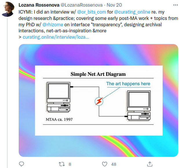
The tweet also comes up mysteriously short in the visual department. Those familiar with MTAA's decades-old "The Art Happens Here" cartoon know that the image was a blinking animated GIF (the lightning bolt trembled). You can't upload those to Twitter -- Twitter converts them to video -- but Rossenova didn't take that step; it was simply rendered as a flat .png. So much for net-art-as-inspiration (&more!). Worse, what is that swirly stuff surrounding MTAA's rectangle? Apparently it was one of a series of ambient backgrounds uploaded to Rhizome's server by an ad agency that did Rhizome's last design. It's basically decorative fluff and has no business being attached to "art" -- imagine a show of 1960s conceptualism at the Metropolitan Museum with Rainbow Brite patterns instead of white walls. So much for "designing archival interactions" and "interface transparency" (again, whatever those might be).

diversity cartoons

Lately we've noticed a decline in the number of those poorly-drawn, schmaltzy "diversity" cartoons on the search page of Eric Schmidt's company, the ones showing an endless parade of cultural others inventing nuclear fusion and breaking world sports records. The problem wasn't the others but the hypocrisy or redwashing since the company is a surveillance Satan dominated by white (and Asian) males. Possibly even the redwashing has grown untenable, with NBC reporting that the company is scaling back its diversity and inclusion efforts. In any case, good riddance to those drawings (if they have in fact gone away).

Update, March 2021: It was too good to be true -- the bad fake diversity drawings have persisted.

weird alphabet letter replaces "L"

weird letter

Art Director: I asked you all to come up with your own ideas this month, let's take a look. What is this?
Illustrator: Well, John Tenniel's birthday's coming up, so I put Alice in the place of the "L" in the company logo.
Art Director: He's not a company-approved "other" but we'll let that pass. I see that Alice is facing the Cheshire Cat and one arm is forming an "L" shape, that's good.
Illustrator: Yeah, isn't that cool--
Art Director: But what about her other arm? Is she making some sort of semaphore or turn signal? What does that do to the "L"? Look, let's shop out Alice's body and just leave the arms. You see? What letter is that? Not an "L," right?
Illustrator: I didn't think--
Art Director: Right, you didn't think. This level of mediocrity is exactly in line with our usual daily artwork. Approved.

bad g**gle drawing of the day - the spectators

bad_spectators

As noted previously, Eric Schmidt's company greenwashes its diversity problem with an endless parade of cultural "others" on its main search page.

Above is a drawing cropped from the same picture as yesterday's bad G**gle image of the day, celebrating women's soccer.
These are the spectators, a happy melting pot of women waving tiny American flags. (With one male, wearing a lei.)
They are all reacting with identical robotic smiles as lady liberty smacks the ball with her shin.
The artist combines Norman Rockwell feelgood-ism with a kind of desperate propaganda style, like old Chinese Communist posters of happy factory workers.

Bonus: If you like women with tiny heads and big thighs, there is a monopoly technology company that openly displays them:

huge_thighs

This somewhat resembles the work of Matisse, except the poor figure drawing is unintentional. He also had a better color sense.