Stowaway, the agenda

In the recent streaming movie Stowaway, a faceless company called Hyperion is sending humans to Mars in small missions to study possible terraforming. For Hyperion read "Netflix," the entertainment juggernaut that funded the film. It's less a movie than a window into current "corporatethink."

The obligatory multi-race, multi-sex crew is transporting some plant life by rocket. On board are a captain and a doctor (Caucasian self-identified females); a scientist (Asian self-identified male); and a technician who accidentally stows away on the ship (black self-identified male). The Mission Control and corporate HQ people back on Earth are all white men wearing Nikes (just kidding -- they are all off camera and off mic in the movie so we don't really know).

There's not enough air for the stowaway and the ship can't return to Earth (for reasons not adequately explained) so the first decision the space team has to make is whether to kill the black dude. I'm not kidding about this; it's actually in the movie.

The most ethical choice is to eliminate the one air breather who "lacks the training" to crew a ship to Mars. Everyone acknowledges this in a meeting held with the black technician not present. The plot pivots on whether a team member or members should take a risky action that may mean they don't have to kill him (because he is a nice guy).

A sane solution might be to finding a way to turn the ship around and go home (the stowaway is discovered minutes after departure -- Earth is still visible out the porthole) or draw straws to see who goes out the airlock but no. The movie is designed to inure us to the kinds of decisions (military, Ayn Randian) that must be made in a universe run by Silicon Valley corporations. Someone has to go -- it's just a question of which expendable(s).
annoying autobiographical post (2)

I took Life Drawing my first semester in college. The professor was Bob Barbee, a short-statured man with a mustache, vaguely military bearing, and a constant cigar in hand or mouth. He would walk around the classroom critiquing students' knowledge of anatomy and offered very little else in the way of art insight. Supposedly one of my classmates "came all the way from Los Angeles to Virginia to study with Bob Barbee" because of the professor's anatomical expertise.

life_drawing_skeleton_650w

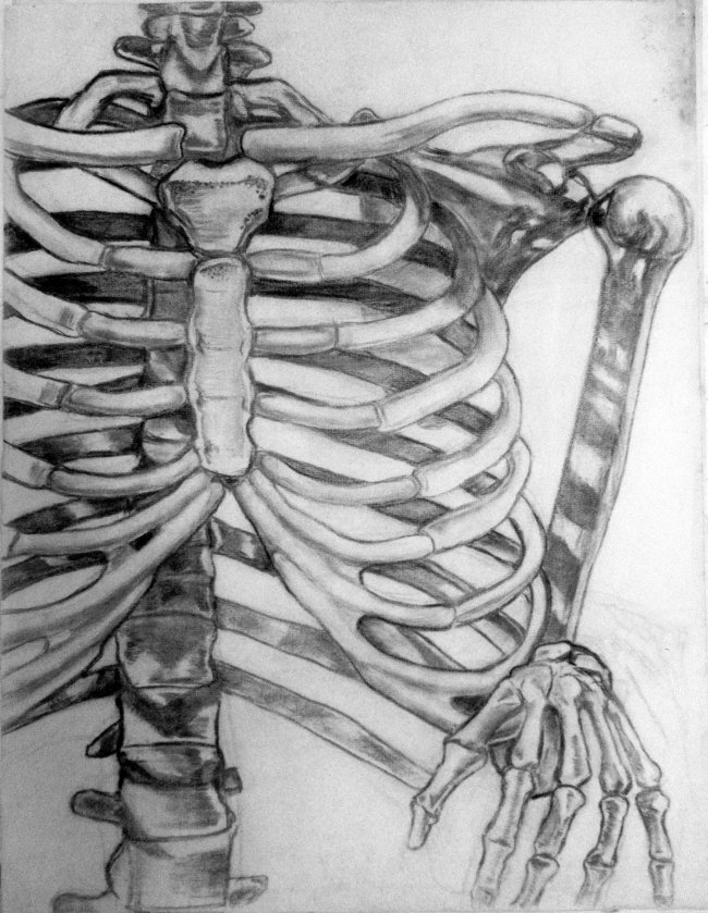
Above is one of my drawings from the class; I was 17 or 18. Were I the teacher I might compliment the aggressive foregrounding (Barbee didn't tell us which part of the skeleton to draw so that was my framing) and the almost abstract emphasis on patterning in the bones and shadows. Or perhaps the use of the hand bones as a punning coda to the rib arrangement. My recollection is that Barbee stopped in front of the drawing and said something like "The xiphoid process should be more elongated, and you need to work on the angle of the acromion." That's the only kind of comment he ever offered.

Later, I decided to complete a studio art major in my last year and a half of college (plus a couple of summers), after having finished my required courses for an English Lit major. Barbee was the only instructor who opposed this "crash course" of almost full-time art practice. He felt like a major should be stretched out over four years of schooling. I had "A" grades in every art class I took except Barbee's. He gave me a B for the Life Drawing class and a C+ for his figure painting class (where students hammered out anatomically correct "mud women," as another professor called them). His reasons for the grade had nothing to do with the quality of the paintings but his belief that I didn't work on them obsessively enough. He pointed admiringly to another classmate, Susan F________, who came in after class hours to work on her painting. (Which is true but she was a clumsy painter and her piece was probably worsened by all the extra effort.) Barbee also candidly admitted he gave me the C+ because he felt I shouldn't be taking so many art courses at the same time.

At the time I took his classes I had never seen his own work. Years later I saw an image of some tree logs in a swamp (I think) done in a somewhat Thomas Hart Benton-esque style. I wasn't too impressed. I was correct about his military background. An obituary notice for Barbee [https://art.as.virginia.edu/sites/art.as.virginia.edu/files/FallWinter2002.pdf] says that his "early training was interrupted by World War II, when he served in the Army Air Force as a bombardier/navigator in Italy." The writer goes on to note, diplomatically, that

"Bob’s work was widely exhibited early in his career. He was represented by a well-regarded gallery in New York, and was included in regional exhibitions in Virginia and the Southeast. His early paintings show the influence of Cézanne and some of the School of Paris painters who were fashionable at mid-century, influences that became less and less important as his art matured. His painting became less abstract and more personal. He came to rely more and more on his keen observation and his real gift as a draftsman. He worked slowly and carefully, sometimes spending years on a painting, and became less interested in exhibiting his work or promoting himself as an artist."

So the moral of the story is, spend years on a painting.

color codes from last night

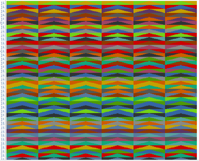
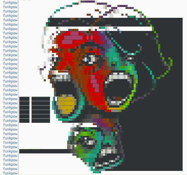
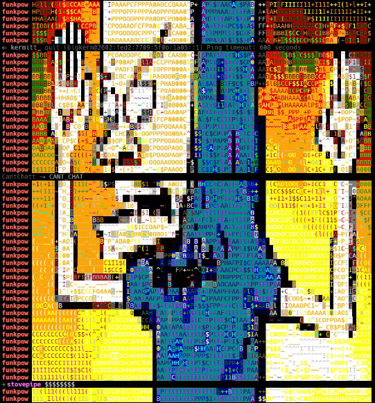
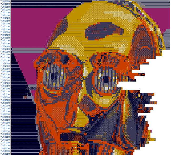
Screenshots of color code art that appeared on my IRC screen during the L0de Radio Hour on YouTube last night.
First, from "ji":

ji_notext_650w

full-size

Then three by "funkpow" (I think an alternate screenname for "funkpower"). The first is slightly washed out because the Hexchat client I use for IRC turns blacks to greys:

A cornholio rendition by funkpow (captured from YouTube, so with darker blacks):

funkpow3_crop

And a final funkpow, a c3po (minus some rude text interruptions):

funkpower2_notext_autoleveled650w

These are some of the more dynamic examples I've seen of this ASCII-type drawing medium. It was fun watching them gradually appear on the screen, line by line.

ffog: what not to do on a website

bopbop

For most people "the web" these days is a platform where they spend much of their time, such as Facebook/Instagram. However, many individuals and business have their own sites outside of platforms. In the 1990s it was possible to create your own page from scratch, put it up on a host service, and have search engines find it. Now most people use professional designers, or their page hosts offer templates created by professional designers. Gradually over the last ten years two factors have changed the look of web pages. First, those professional designers like to use "scripts" such as javascript to build browser-readable pages (even though a simple HTML page is all that's necessary to be public). Secondly, more and more people have employed smartphones rather than desktops to access the web, which has necessitated changes in page design.
What's emerged is a horrible style of web page that features empty space, big blocks of color and endless scrolling: infantilizing masquerading as tasteful. It's increasingly the standard look for media publications as well businesses and individual pages. One might hate this style but lack the vocabulary to critique it, because professionalized tricks and jargon have become more opaque and intimidating over the years. What are these design Morlocks doing exactly and how did we get here?
Fortunately ffog (with assistance from fanfare) has made a page called what not to do on a website which gets into the minutiae. Some bullet points are tech-related but mostly they're just common sense design critique.
Below is ffog's list (a work in process) of things not to do (which are in fact being done everywhere):

  • advertising business model
  • dark patterns
  • unrelated content
    • reddit "More posts ..."
    • youtube "Recommended for you"
    • news sites that load another article at the end
    • youtube autoplay. soundcloud neverending music
  • trend-copying design
  • peek-a-boo elements examples
  • large sections with bountiful negative space that look nice but have no real content
    • example: every startup website on the internet
  • endless scrolling
  • 5 min. read
  • change default scroll behavior whatsoever
  • intercepting native copy-paste
  • mindless humor bereft of biting truth used in an attempt to not seem stuffy
  • indulgent explanations of basic concepts instead of just enough detail
  • exclamation points
  • social icons
  • most modals [see wikipedia modal window --tm]
    • medium.com aggressive signup links
    • dimming window showing anything
  • sticky headers
  • almost all comments sections
  • conversational titles
    • "Yes, ..."
    • "... Here's Why."
  • unhelpful 404 pages
    • cute oopsie messages
    • anything alluding to the user having done something wrong
    • error pages that don't try to figure out what the user was looking for to help direct them
  • circle avatars
  • anything with mustaches, bacon, ftw, coffee, beer, chuck norris, etc
  • made with <3 in toledo
  • pop-ups for a tour of features you can't exit
  • gamification
  • transition animations everywhere as you scroll
  • intentionally buried or hidden settings
  • forced features
    • twitter moments
  • misplaced ai
    • twitter, facebook altered timeline with no options
  • mention blockchain

wikihow

screencaptures: fanfare

annoying autobiographical post

Over the years I've bounced among art, music, and writing, the third of these being mainly parasitic to the first two. Meaning, I don't write so much to tell a story as to grapple with some art idea.
My college years were happily spent studying all the arts. This was back when you could have a "life of the mind" without going deeply into debt.
I took classes in music appreciation, electronic music (with a focus on composing), poetry- and fiction-writing, and history, in addition to my "majors" in studio art and English lit. I had a weekly FM radio show for my entire four years in school, and was music director and then program director of the station.
This was "free form radio" of the WFMU variety (which started as a college station) where I played jazz, prog rock, classical, and the beginnings of punk, postpunk and electronic pop. The mid-'70s were contentious times in music, with battle lines drawn, and people would call the station and berate the DJ for playing Cecil Taylor or Van Der Graaf Generator, depending on which set of sensibilities those artists offended. Fans of The Stooges despised fans of Kraftwerk, etc.
I wrote a couple of music reviews for the college newspaper and did some music "zine" writing. The newspaper reviews were well-regarded by the editors and I received calls fairly regularly asking if I could please submit more. By that point I was cramming a studio art major into my last year and a half of school and had no time or inclination to write.
My first newspaper review described a campus pub concert by Grits, a Washington DC-area band that played rock of Zappa-esque complexity. Grits never got a record contract, which seems to have devastated them personally, but are remembered on some later-released CDs, including a fairly representative live concert [YouTube]. I also reviewed Mike Oldfield's third LP in a piece titled "Ommadawn Suffers from Overdubbing." For Hal Dean's music zine Brilliant Corners I did an overview of Soft Machine's career.
For my literary studies I was lucky to have three classes with Daniel Albright, a consistently brilliant scholar and critic who later achieved fame as a musical theorist. My classes were The Experimental Novel (Lawrence, Woolf, Pynchon, Nabokov, Beckett, et al), The Aesthetic Movement (Tennyson, Arnold, Wilde, Hopkins) and 20th Century British Poetry (Eliot, Yeats, Pound). I asked Albright to be my faculty adviser and he gave his somewhat befuddled consent. (A condescending grad student supervising undergrad majors asked "Did you just wander into his office?") Albright and I had very little interaction; if anything he made me realize I didn't want to be an English prof because I could never delve into the minutiae of other artists' lives and works to the extent he did. I felt that to be original I would have to be that voracious and I was grossly overmatched. Nevertheless his A- grade and the "well written indeed" he jotted on a paper I wrote on Eliot kept me in high spirits for years.
My best grades and greatest enthusiasm came in Studio Art classes. I had some initial discouragement in the classes of Bob Barbee, a life drawing and painting instructor who taught classical technique deprived of anything resembling joy (another prof noted that all his students' paintings were anatomically correct "mud women" rendered in burnt umber and lead white). Then, I discovered I could paint photorealistically in oils, and quickly got a handle on printmaking methods, and was able to start building a body of my own characteristic work. We majors had weekly seminars where we took field trips to Washington DC art galleries and museums and did slide talks on the minimal and conceptual art trends we found there. I did a talk on Daniel Brush, who combined Color Field and minimalist ideas and subsequently had an under-the-radar career making objects in pure gold for a wealthy, discreet clientele. He is in most ways my opposite but I spoke passionately about his straight line paintings made with a fountain pen on canvas.

[to be continued]