Good breakdown from fanfare on the obnoxious trend of peekaboo scrolling on web pages (notably the search results page from Eric Schmidt's company).
A terrible trend on the Internet is the peek-a-boo effect. It can come at you through a variety of ways.
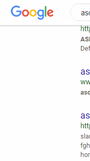
One common way is when a website tries to preserve the visibility of the header when you scroll down, through the use of a transition or an animated effect. I assume the logic is that once you've scrolled all the way down a page, the header is out of sight, and getting back to it would require the brutal task of scrolling up (or in the case of a touch screen, swiping up) and that's way too much work. So to make things easier, websites try and keep the header fixed at the top, all the time. Okay - that seems like a decent solution to a problem. So why not just use position:fixed any be done with it? Why use a 'seamless' transition --using animation--, which by definition won't look seamless, because an animated effect on an otherwise static page is an attention-seeker, and therefore a distraction! It's calling attention to the most unnecessary part of a web browsing experience.
An even more infuriating example in this variety of header peek-a-boo effects are websites that wait until you've scroll down a bit on the page, then trigger the re-emergence of the header, once you've scrolled up, even by a hair. It's absolutely jarring, especially if you use the scroll wheel a lot, and move an article up an down a bit just out of habit.
Another example is the jack in the box peek-a-boo effect, in which a div is hidden off-screen then POPS out once you've hit a certain point on the page. I assume this is meant to be less of a surprise than a sudden popup modal that pops up on the page without warning like a screamer (e.g. SIGN UP FOR OUR MAILING LIST), but the effect is just as bad, if not worse.