"Frienemies"

frienemies editing detail

"Frienemies" [mp3 removed - please listen to the 2018 remixed version]

This "verse" was working so I opted not to have a "chorus"; the "dropout" is the only concession to songcraft. I might chop it up eventually but right now it is a "steady state" minimal tune that is more about ringing (slight, semi-automatic) changes on one basic riff. The title is a bit dire for the material--it's kind of a happy piece. But I do think a lot about this word and how it arose to fill a need in our discourse. Everyone seems to recognize the type--what did we call them before? Are there more frienemies, or are we just better at spotting them?

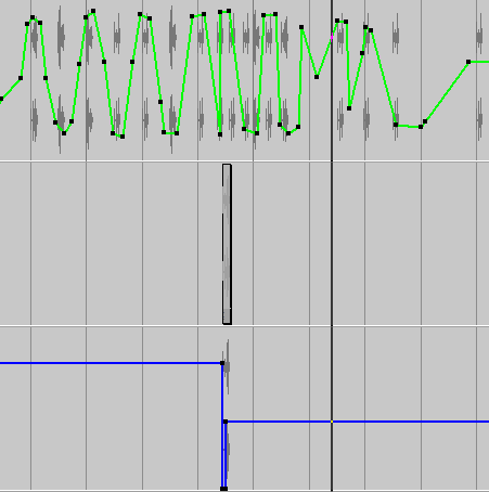
(The image is a detail of the score.)

"I Wish I Didn't"

"I Wish I Didn't" [mp3 removed]

The violin solo at the end (with sequencer underneath) is a faint homage to Tuxedomoon, but the speech synthesis parts are decidedly unromantic.

earcon CD cover

This is the cover for John Parker's Party Lion CD, recorded under his earcon alias. I did the drawing in MSPaint and Parker designed the type. He tells me that an "earcon" was someone's failed attempt to make an audio icon for the web--failed as in, it didn't catch on. (Just to put it in proper webtrash-appropriating perspective.)
Buy the disc and read the interview at CD Baby, this is real take-no-prisoners manifesto writing. It will convince you to sell your analog gear and old computer from the '80s and start dorking around with some of the current, relatively inexpensive electronic music making tools that are out there.

Richard Prince at the Guggenheim

Notes on the Richard Prince's mid-career retrospective at the Guggenheim (his second--the first was at the Whitney in '92).

1. The signature early photos rephotographed from advertisements grab you with their icy coldness and near-claustrophobic perfection of composition/cropping. They are slightly eerie in their grainy, one-step-removed distance from their subjects, and obsessive in their focus on the banal: labels/logos, product photography (furniture, jewelry), male and female models (looking in the same direction).

2. The show gets worse as you move up the Guggenheim ramp. The photos, joke paintings, and car hood sculptures all get larger, messier, overworked, "painterly" for no particular reason, climaxing with the execrable "nurse paintings" and the even more execrable "De Kooning Women" paintings. Copying the "modern masters" is the kiss of death.

3. The exhibition curator mixes old and new work in apparent attempt to obscure this decline. The rephotographed "girlfriend photos" of biker babes mingle with the boring, Eggleston-lite upstate NY photos of the late '90s. The so-so car hoods are interspersed with the monochrome joke paintings as if to say "See, viewers? Both are minimal. Can you say minimal?" The "gangs" series of photomontages of '86-'87 (groups of related images such as battlefield photos, tidal waves, hair bands, more biker girls) is broken apart and spread evenly throughout the show.

4. Prince's content shifts with the winds of the market. After the Neo Geo era of the mid '80s he switched from photo-appropriation to "hard edged painting" (the joke monochromes). When the art world began embracing large scale photos in the late '90s (Gursky, Tillmans, Billingham), Prince returned to Marlboro cowboys, but larger, and began showing celebrity headshots and memorabilia. When the painting madness returned with the influx of Bush tax cut millionaire funny money, Prince went back to big paintings (cancelled checks, nurses). Of course he worked in multiple media all along, but these are the broad trends.

5. The early work is incisive and perceptive and earned him his "place in history." Too bad about the rest of it--at least it wasn't as horrific as late Johns.