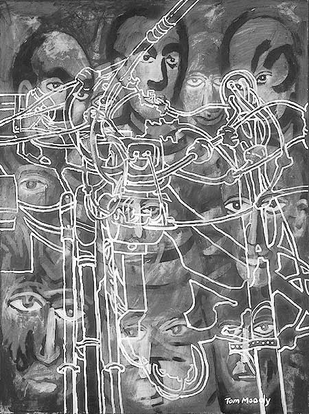
the original is 40 x 30 inches, acrylic on canvas, and in color. it's meant to be a goof on expressionism, somewhat, and I think I like it better as a black and white book illustration.
Update: Need to add a few sentences to this post, as the image above is completely overwhelming the "camp child" below. In the past have described such writing as a "text buffer." Almost no thought is given on blogs as to how visual content interacts with nearby visual content. Museum curators go to great pains in the placement of art on walls, to the extent even of placing a weak piece next to a strong piece so as not to have the works "vibrating badly," as Walter Hopps once stated it. Yet on blogs the most outrageous juxtapositions are made. To some extent we rely on a kind of selective blindness, such as you see in newspapers when an image of a vivacious fashion model sits next to a story about people dying from living too near toxic waste. But it's also a lack of attention to design. Etc.