
A while back artist Brad Troemel wrote an essay called What Relational Aesthetics Can Learn From 4Chan.
Now we have a South by Southwest panel called Haters Gonna Hate: Lessons For Advertisers From 4chan.
photo: erikhaspresence
A while back artist Brad Troemel wrote an essay called What Relational Aesthetics Can Learn From 4Chan.
Now we have a South by Southwest panel called Haters Gonna Hate: Lessons For Advertisers From 4chan.
photo: erikhaspresence
Friends and longtime blog-glancers know I like the old, early '90s version of Microsoft Paint called Paintbrush (originally made by a company called Z-Soft that Bill Gates bought) and only tolerate the supposed improved version, called Paint or MSPaint. Now it's been improved again in Windows 7, meaning they tried to make it more like Photoshop. A few quick notes:
1. The "spraycan" tool still looks like a miserable bee-swarm.
2. You can still do the MSPaint secrets Travis found, such as holding the shift key while dragging a pasted area to make a quasi-brush. I can't verify whether fattening lines and selected areas can still be done using [Ctrl and Numpad +] because my netbook with W7 has no number pad.
3. Some new mostly useless polygon shapes are available.
4. A limited palette of hideous Photoshop filter-like textures is now included, such as this "crayon shading" or whatever it's supposed to be.
5. A new selection of brushes that imitate watercolor strokes has been added. These automatically anti-alias when you release the click, so they look nice and smooth at the edges. Unfortunately when you use a fill color the anti-aliased area shows up as white! Nice going, guys.
6. Some transparency is available in the new "soft" brushes." This might be useful but all subtle gradations are lost unless you save to .png.
7. The old pencil tool can still be used to outline and fill, to prevent the problem described in #5 above. The pencil now has more line widths, as seen in the example. Still need to test if this can be fattened further using [Ctrl and Numpad +].
8. Even if the washy effect of transparent brushstrokes is lost on saving to GIF or BMP, having the ability to "bleach" existing colors might be good--need to play with it more.
All in all, still a crap tool, now with features lifted from the king of crap toolmakers, Adobe.
Found here on Feb 17, 2011.
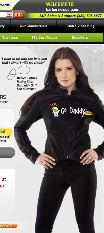
Best known for her layering of ironic red and white captions in Future Bold Oblique font over black and white stock photos when she virtually defined the art world of the 1980s, Barbara Kruger has somewhat dramatically shifted her style in the Net Era. Her recent work imitates the lowbrow styles of parked domains and pharmaceutical ads, exposing the masculinist codes of current web design: for example, employing a "babelicious" female in a traditionally macho profession such as race car driving to serve as a spokesmodel. For Kruger online discourse is a Freudian joke, as seen in the above piece titled "Go Daddy" (2009), which mimics an expired Barbara Kruger domain.