Artforum review of John Pomara exhibition, 1991 (author's cut)

john_pomara_96_tears_650w

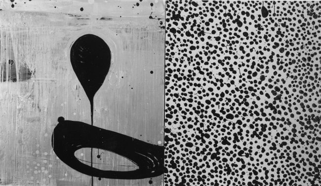
John Pomara, 96 Tears
oil and enamel on canvas
72 x 124 inches
photo: Harrison Evans
larger view

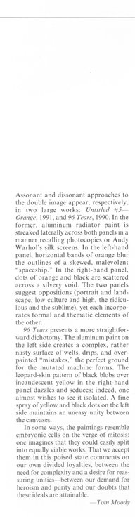
Below is a corrected "author's cut" of a review that originally appeared in Artforum, in December 1991. A post noting the changes was put up previously.

Dallas Reviews, December 1991
John Pomara
EUGENE BINDER GALLERY

In John Pomara’s paintings from the first half of the ’80s, turbulent color fields surrounded silhouetted black abstract forms, evoking robots and spaceships. The science fictional elements combined with graffiti and neo-Expressionist iconography to comment obliquely on the failed aspirations of both mid-century science (Sputnik gone awry) and the artistic would-be heroism of the Abstract Expressionists. The painterly brio of Pomara’s brushwork competed with the dopey, out-of-kilter robotic forms, suggesting a paradox -- the investment of substantial physical energy in the depiction of entropy and collapse.

As the art of the ’80s cooled down, so did Pomara’s, but without abandoning its basic themes or its commitment to paint. The entropic forms remained, but the full-spectrum color and diagrammatic scribblings of the surrounding fields gave way to starker, more subtle painterly effects. As if to compensate for the change, Pomara began to place second panels -- typically fields of dots or organic blobs -- adjacent to the figure-ground studies. On the whole, the added panels suggest a more upbeat approach to art and science than their companions do. Here an interest in investigating patterns of chaos joins Pomara’s characteristic skepticism and taste for paradox.

The new diptychs create dialogues (never simplistic dichotomies) between high and low, macro and micro, esthetic and antiesthetic. The vertical line separating each pair of panels becomes a permeable membrane allowing ideas, motifs, and colors to pass between the rectangles, unifying the paintings and subverting the usual cliches of the diptych format. Assonant and dissonant approaches to the double image appear, respectively, in two large works: Untitled #5 -- Orange, 1991, and 96 Tears, 1990. In the former, aluminum radiator paint is streaked laterally across both panels in a manner recalling photocopies or Andy Warhol’s silk screens. In the left-hand panel, horizontal bands of orange blur the outlines of a skewed, malevolent “spaceship.” In the right-hand panel, dots of orange and black are scattered across a silvery void. The two panels suggest oppositions (portrait and landscape, low culture and high, the ridiculous and the sublime), yet each incorporates formal and thematic elements of the other.

96 Tears presents a more straightforward dichotomy. The aluminum paint on the left side creates a complex, rather nasty surface of welts, drips, and over-painted “mistakes,” the perfect ground for the mutated machine forms. The leopard-skin pattern of black blobs over incandescent yellow in the right-hand panel dazzles and seduces; in fact, one almost wishes to see it isolated. A fine spray of yellow and black dots on the left side maintains an uneasy unity between the canvases.

In some ways, the paintings resemble embryonic cells on the verge of mitosis: one imagines that they could easily split into equally viable bodies of work. That we accept them in this poised state comments on our own divided loyalties: between the need for complexity and a desire for reassuring unities; between our demand for heroism and purity and our doubts that these ideals are attainable.

—Tom Moody

from the vault: my Artforum review of John Pomara, 1991

pomara1 pomara2

PUBLISHED REVIEW
This was my second Artforum review. As with the Linda Ridgway review, I didn't receive the customary writer-editor phone call so the review went to press with some confusing mistakes. In the "author's cut" version at the bottom of this post, I've attempted to fix the damage. It was partly my fault for writing a cute lead sentence about the new work followed by immediate backtracking to discuss older work; this clearly confused the editor. The solution was to eliminate the lead and start at the beginning of the work's chronology.

Dallas Reviews, December 1991
John Pomara
EUGENE BINDER GALLERY

John Pomara’s recent work may reflect a split personality, but it’s ours as much as his. In paintings from the first half of the ’80s, turbulent color fields surround silhouetted black abstract forms, evoking robots and spaceships. The science fictional elements combine with graffiti and neo-Expressionism to comment obliquely on the failed aspirations of both mid-century science (Sputnik gone awry) and the painterly heroism of the Abstract Expressionists. The painterly brio of Pomara’s work compete with the dopey, out-of-kilter robotic forms, suggesting a paradox—the investment of substantial physical energy—in the depiction of entropy and collapse.

As the art of the ’80s cooled down, so did Pomara’s, but without abandoning its basic themes or its commitment to paint. The entropic forms remained, but the full-spectrum color and diagrammatic scribblings of the surrounding fields gave way to starker, more subtle painterly effects. As if to compensate for the change, Pomara began to place second panels—typically fields of dots or organic blobs—adjacent to the figure-ground studies. On the whole, the added panels suggest a more upbeat approach to art and science than their companions do. Here an interest in investigating patterns of chaos contrasted with Pomara’s characteristic skepticism and taste for paradox.

The new diptychs create dialogues (never simplistic dichotomies) between high and low, macro and micro, esthetic and antiesthetic. The vertical line separating each pair of panels becomes a permeable membrane allowing ideas, motifs, and colors to pass between the rectangles, unifying the paintings and subverting the usual cliches of the diptych format. Assonant and dissonant approaches to the double image appear, respectively, in two large works: Untitled #5—Orange, 1991, and 96 Tears, 1990. In the former, aluminum radiator paint is streaked laterally across both panels in a manner recalling photocopies or Andy Warhol’s silk screens. In the left-hand panel, horizontal bands of orange blur the outlines of a skewed, malevolent “spaceship.” In the right-hand panel, dots of orange and black are scattered across a silvery void. The two panels suggest oppositions (portrait and landscape, low culture and high, the ridiculous and the sublime), yet each incorporates formal and thematic elements of the other.

96 Tears presents a more straightforward dichotomy. The aluminum paint on the left side creates a complex, rather nasty surface of welts, drips, and over-painted “mistakes,” the perfect ground for the mutated machine forms. The leopard-skin pattern of black blobs over incandescent yellow in the right-hand panel dazzles and seduces; indeed, one almost wishes to see it isolated. A fine spray of yellow and black dots on the left side maintains an uneasy unity between the canvases.

In some ways, the paintings resemble embryonic cells on the verge of mitosis: one imagines that they could easily split into equally viable works. That we accept them in this poised state comments on our own divided loyalties, between the need for complexity and a desire for reassuring unities—between our demand for heroism and purity and our doubts that these ideals are attainable.

—Tom Moody

AUTHOR'S CUT

Dallas Reviews, December 1991
John Pomara
EUGENE BINDER GALLERY

In John Pomara’s paintings from the first half of the ’80s, turbulent color fields surrounded silhouetted black abstract forms, evoking robots and spaceships. The science fictional elements combined with graffiti and neo-Expressionist iconography to comment obliquely on the failed aspirations of both mid-century science (Sputnik gone awry) and the artistic would-be heroism of the Abstract Expressionists. The painterly brio of Pomara’s brushwork competed with the dopey, out-of-kilter robotic forms, suggesting a paradox -- the investment of substantial physical energy in the depiction of entropy and collapse.

As the art of the ’80s cooled down, so did Pomara’s, but without abandoning its basic themes or its commitment to paint. The entropic forms remained, but the full-spectrum color and diagrammatic scribblings of the surrounding fields gave way to starker, more subtle painterly effects. As if to compensate for the change, Pomara began to place second panels -- typically fields of dots or organic blobs -- adjacent to the figure-ground studies. On the whole, the added panels suggest a more upbeat approach to art and science than their companions do. Here an interest in investigating patterns of chaos joins Pomara’s characteristic skepticism and taste for paradox.

The new diptychs create dialogues (never simplistic dichotomies) between high and low, macro and micro, esthetic and antiesthetic. The vertical line separating each pair of panels becomes a permeable membrane allowing ideas, motifs, and colors to pass between the rectangles, unifying the paintings and subverting the usual cliches of the diptych format. Assonant and dissonant approaches to the double image appear, respectively, in two large works: Untitled #5 -- Orange, 1991, and 96 Tears, 1990. In the former, aluminum radiator paint is streaked laterally across both panels in a manner recalling photocopies or Andy Warhol’s silk screens. In the left-hand panel, horizontal bands of orange blur the outlines of a skewed, malevolent “spaceship.” In the right-hand panel, dots of orange and black are scattered across a silvery void. The two panels suggest oppositions (portrait and landscape, low culture and high, the ridiculous and the sublime), yet each incorporates formal and thematic elements of the other.

96 Tears presents a more straightforward dichotomy. The aluminum paint on the left side creates a complex, rather nasty surface of welts, drips, and over-painted “mistakes,” the perfect ground for the mutated machine forms. The leopard-skin pattern of black blobs over incandescent yellow in the right-hand panel dazzles and seduces; in fact, one almost wishes to see it isolated. A fine spray of yellow and black dots on the left side maintains an uneasy unity between the canvases.

In some ways, the paintings resemble embryonic cells on the verge of mitosis: one imagines that they could easily split into equally viable bodies of work. That we accept them in this poised state comments on our own divided loyalties: between the need for complexity and a desire for reassuring unities; between our demand for heroism and purity and our doubts that these ideals are attainable.

—Tom Moody

notes for my Linda Ridgway review

Below is a corrected "author's cut" of a review that originally appeared in Artforum, in October 1991. A post noting the changes was put up previously.
Following the review are scans of my gallery notes. After going to so much trouble to note the pieces and their locations, it was discouraging to have several works mis-described in the published review. One of the hazards of art-writing is an editor who didn't see a show changes the meaning of work in an attempt to make the writing flow better. As I noted earlier, this is usually resolved in a pre-publication discussion with the editor and writer. Artforum was always good about that, from my third review to the end (1992-1999), but the first two reviews "fell through the cracks." Belated apologies to the artists (again).

Dallas Reviews, Artforum, October 1991
Linda Ridgway
GERALD PETERS GALLERY

Linda Ridgway isn’t generally thought of as an installation artist, but this exhibit of three-dimensional objects worked so well as a unit that one almost hated to think of its component parts removed from each other’s company. Though Ridgway’s abstractions function as autonomous works, here she positioned them to heighten their theatrical interaction: they sat resolutely on the floor, hung purposefully from walls, or dropped delicately from the ceiling. Indeed, her materials—bronze, wood, hemp, wax, cement, and hydrastone (finished with a broad spectrum of surface treatments and patinas)—were distributed throughout the gallery with a feeling of proportion verging on the mathematical. The result could be compared to an Oriental garden dotted with shapes and textures. In many of the works, the yin of serene orientalism plays off the yang of a certain Western lack of couth. In Well Pull and Bishop’s Poem, both 1990, pristine forms hang from the wall in slings of dung-textured bronze. In Waking, 1990, fibrous “hairs” protrude from smooth layers of cement and wax. In Well Point, 1991, a bronze talon points suggestively toward a punctured disk jutting from the wall. In all of these, the rough and the stately were dramatically wed.

Ridgway commands, but never flaunts, an impressive range of techniques; in fact, her handling of difficult substances and processes is so understated that viewers might almost have missed the fact that this show consisted of one virtuoso technical feat after another. Under her control, bronze becomes malleable, a material to be spun into spidery filaments or compacted into dense clumps; so transformed, it seems light-years distant from the stench and sweat of the foundry. In Plowman, 1990, a multi-part work, the metal takes on strikingly different aspects: a battered pot, a tightly coiled mat, or an elegant line drawing in space.

Though I referred to Ridgway’s works as abstractions, the designation is not entirely fair; perhaps “abstract-plus” would be more accurate. Some of her pieces recall tools but, like archaeological artifacts in various stages of restoration, their original function is lost to us. Other objects, such as Hullman’s Three, 1990, with its tapering, fingerlike pods of rough bronze, might be vegetables that have managed to evade the watchful eye of the taxonomist. Still others evoke comparisons to immediately recognizable phenomena, as in Power of Ra (Domain), 1990-91, where a verdigris-tinted bronze cone suggests the action of a volcano, with its peak collapsing into a crater and a rivulet of bronze lava trickling down its slope. Nevertheless, in every case, shorthand descriptions of the works -- leaf, bracelet, basket, bullet, plumb bob -- seem inadequate as soon as they are uttered. Ridgway’s objects are signifiers sans signifieds, steadfastly deflecting attempts to label them while consistently inviting us to try. —Tom Moody

ridgwaynotes1thum ridgwaynotes2thum
ridgwaynotes3thum ridgwaynotes4thum
ridgwaynotes5thum ridgwaynotes6thum
ridgwaynotes7thum ridgwaynotes8thum
ridgwaynotes9thum

(scans of drawings, ink on newsprint, 1991)

Linda Ridgway, Well Pull, 1990

linda_ridgway_well_pull_photo

Bronze, 39 x 12 x 5 1/2 inches

...from the show that was the subject of my first Artforum review in 1991

The dimensions above are from the gallery checklist. The dimensions in the Artforum photo caption are the same ones on the back of this press photo. My memory of the piece is that it jutted out from the wall 5 1/2 inches at the bottom, not 12 inches.

from the vault: my Artforum review of Linda Ridgway (author's cut)

ridgway1 ridgway2

PUBLISHED REVIEW
This was my first Artforum review and I was fairly happy with it. The editor (I assume Jack Bankowsky, who was reviews editor at the time) tightened up my prose, substituting formal words for some of my more casual phrasing (and added two "indeeds" that weren't in my draft). Normally the practice in the early 1990s was for editors to call the writer, read the piece through, and discuss changes. For my first two reviews I didn't get a call and several inaccurate descriptions of Ridgway's work went in. The "author's cut" of the review below corrects these errors.

Dallas Reviews, Artforum, October 1991
Linda Ridgway
GERALD PETERS GALLERY

Linda Ridgway isn’t generally thought of as an installation artist, but this exhibit of three-dimensional objects worked so well as a unit that one almost hated to think of its component parts removed from each other’s company. Though Ridgway’s abstractions function as autonomous works, here she positioned them to heighten their theatrical interaction: they sat resolutely on the floor, hung purposefully from walls, or dropped delicately from the ceiling. Indeed, her materials—bronze, wood, hemp, wax, cement, and hydrastone (finished with a broad spectrum of surface treatments and patinas)—were distributed throughout the gallery with a feeling of proportion verging on the mathematical. The result could be compared to an Oriental garden dotted with shapes and textures. In many of the works, the yin of serene orientalism plays off the yang of a certain Western lack of couth. Pristine forms hang from the wall in slings of dung-textured bronze. In Well Pull and Bishop’s Poem, both 1990, fibrous “hairs” protrude from smooth layers of cement. In Waking, 1990, a bronze talon points suggestively toward a punctured disk jutting from another work (Well Point, 1991). In each of these, the bombastic and the stately were dramatically wed.

Ridgway commands, but never flaunts, an impressive range of techniques; indeed, her handling of difficult substances and processes is so understated that viewers might almost have missed the fact that this show consisted of one virtuoso technical feat after another. Under her control, bronze becomes malleable, a material to be spun into spidery filaments or compacted into dense clumps; so transformed, it seems light-years distant from the stench and sweat of the foundry. In Plowman, 1990, the metal takes on strikingly different aspects: a battered pot, a tightly coiled mat, or an elegant line drawing in space.

Though I referred to Ridgway’s works as abstractions, the designation is not entirely fair; perhaps “abstract-plus” would be more accurate. Some of her pieces recall tools but, like archaeological artifacts in various stages of restoration, their original function is lost to us. Other objects, such as Hullman’s Three, 1990, with its tapering, fingerlike pods of rough bronze, might be vegetables that have managed to evade the watchful eye of the taxonomist. Still others evoke comparisons to immediately recognizable phenomena, as in Power of Ra (Domain), 1990-91, where a verdigris-tinted bronze cone suggests the action of a volcano, its peak collapsing into a crater, as a rivulet of bronze lava trickling down its slope. Nevertheless, in every case, shorthand descriptions of the works -- leaf, bracelet, basket, bullet, plumb bob -- seem inadequate as soon as they are uttered. Ridgway’s objects are signifiers sans signifieds, steadfastly deflecting attempts to label them while consistently inviting us to try. —Tom Moody

AUTHOR'S CUT

Dallas Reviews, Artforum, October 1991
Linda Ridgway
GERALD PETERS GALLERY

Linda Ridgway isn’t generally thought of as an installation artist, but this exhibit of three-dimensional objects worked so well as a unit that one almost hated to think of its component parts removed from each other’s company. Though Ridgway’s abstractions function as autonomous works, here she positioned them to heighten their theatrical interaction: they sat resolutely on the floor, hung purposefully from walls, or dropped delicately from the ceiling. Indeed, her materials—bronze, wood, hemp, wax, cement, and hydrastone (finished with a broad spectrum of surface treatments and patinas)—were distributed throughout the gallery with a feeling of proportion verging on the mathematical. The result could be compared to an Oriental garden dotted with shapes and textures. In many of the works, the yin of serene orientalism plays off the yang of a certain Western lack of couth. In Well Pull and Bishop’s Poem, both 1990, pristine forms hang from the wall in slings of dung-textured bronze. In Waking, 1990, fibrous “hairs” protrude from smooth layers of cement and wax. In Well Point, 1991, a bronze talon points suggestively toward a punctured disk jutting from the wall. In all of these, the rough and the stately were dramatically wed.

Ridgway commands, but never flaunts, an impressive range of techniques; in fact, her handling of difficult substances and processes is so understated that viewers might almost have missed the fact that this show consisted of one virtuoso technical feat after another. Under her control, bronze becomes malleable, a material to be spun into spidery filaments or compacted into dense clumps; so transformed, it seems light-years distant from the stench and sweat of the foundry. In Plowman, 1990, a multi-part work, the metal takes on strikingly different aspects: a battered pot, a tightly coiled mat, or an elegant line drawing in space.

Though I referred to Ridgway’s works as abstractions, the designation is not entirely fair; perhaps “abstract-plus” would be more accurate. Some of her pieces recall tools but, like archaeological artifacts in various stages of restoration, their original function is lost to us. Other objects, such as Hullman’s Three, 1990, with its tapering, fingerlike pods of rough bronze, might be vegetables that have managed to evade the watchful eye of the taxonomist. Still others evoke comparisons to immediately recognizable phenomena, as in Power of Ra (Domain), 1990-91, where a verdigris-tinted bronze cone suggests the action of a volcano, with its peak collapsing into a crater and a rivulet of bronze lava trickling down its slope. Nevertheless, in every case, shorthand descriptions of the works -- leaf, bracelet, basket, bullet, plumb bob -- seem inadequate as soon as they are uttered. Ridgway’s objects are signifiers sans signifieds, steadfastly deflecting attempts to label them while consistently inviting us to try. —Tom Moody