Day: December 25, 2008
more on chord equivalents in visual art
Discussing "chord equivalents" in visual art with TH by email on Christmas.
Kandinsky and the Bauhaus covered some of this but not sure how much attention it's gotten lately.
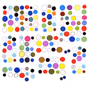
"Palettes" would be the equivalent of scales: pentatonic, diatonic, etc.--the note universe or family of a given work.
Thus in computer graphics, the MSPaint palette is 16 color hexadecimal, but you could also have kid pix & mario paint palettes (hat tip Travis Hallenbeck) or Photoshop.
Whereas, "chords" would be, e.g., red-white-blue (the USA PATRIOT chord--ugh), yellow ochre and orange (a two note chord--Southwest Airlines), etc.
The "Southwest Airlines chord" is no more absurd than saying "the harmonic seventh chord is also widely used in 'blues flavored' music" or, better, "the tonic is the note of the scale that is considered the most important." (quotes from Wikipedia)
The musical statements are claimed to have mathematical certainty based on pitch and harmonic relations but it's really as entirely subjective as would be saying that ochre is the "key" to the Southwest Airlines color scheme.
I know this isn't an original thought--12-tone music was based on a critique of pitch hierarchies. But I think in visual art people stopped prioritizing colors sometime around the Enlightenment whereas in "western music" pitches, chords, and modes continue to be microanalyzed, ranked, and named to an insane extent.
For example (more Wikipedia), consider scale degrees:
in English, [they are known] by the names tonic, supertonic, mediant, subdominant, dominant, submediant, leading tone.
These names are derived from a scheme where the tonic note is the 'center'. Supertonic and subtonic are, respectively, one step above and one step below the tonic; mediant and submediant are each a third above and below the tonic, and dominant and subdominant are a fifth above and below the tonic.
Translating this into visual terms:
"In the 'US flag color scheme' red is at the center and therefore the tonic; white is the supertonic and blue is the mediant."
That's just silly but the same types of statements are not considered silly by music pedants.
For the record, I know that visual art has theories of complementary colors, the golden section, etc. It's just that they are rules of thumb, learned in first year studio classes and then basically non-issues. It's really chord theory, and its lack of a counterpart in painting, that's perplexing me this holiday season.
chord theory vs color theory rambling
From the history of tracker music on Wikipedia:
Most early tracker musicians were from the United Kingdom and Scandinavia. This may be attributable to the close relationship of the tracker to the demoscene, which grew rapidly in Scandinavian countries, and the relative affordability in the UK of computers able to run tracker software. Tracker music became something of an underground phenomenon, especially as so much contemporary chart music was then sample-based dance music (a genre relatively simple to produce with step-based sequencing). In fact, several chart-topping 1989/1990-era dance singles strongly foreshadow compositional trends in tracker music which would remain popular for many years to come; in particular, 808 State's "Pacific" and Octave One's "I Believe." Both tracks rely heavily on muted, detuned saw-wave background pads which play four-tone augmented major seventh chords in chord patterns which fit the pentatonic scale; an unsyncopated 4/4 drum beat runs underneath. Though this particular musical arrangement was scarcely heard earlier, an overwhelming number of tracker compositions in following years used the exact same pattern.
Love this kind of music nerd analysis of pop music and wish I could write it better. The bolded passage led to a night of brushing up on my college music appreciation by researching chord families and scales and listening to sound clips (Wikipedia seems to be undergoing a transition between midi files and an open source Flash type player for clips, by the way.) Have a nascent speculation/beef about the absurdity of naming and nailing chord properties vis a vis painting, where no one gives a shit about quantifying different clusters of pigments vibrating at certain wavelengths, but should probably see what Goethe has to say about this before taking it further.

