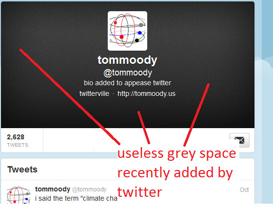
I know, I know, the grey space is supposed to be a "header" and you're supposed to decorate it with your own or others' designs. Twitter wants you to have a header so bad they're holding the space for ransom with this hideous charcoal slab. As with 99% of web design it was fine before they improved it -- just a thin wedge of text next to your avatar telling who you are. The initial appeal of twitter was its simplicity, but Rule One of web design is start simple, gradually fill up space with crap.