"An example of how cogently [Rachel] Harrison presents some of these concerns is seen in 5x7s (A&R Quality Photo...), 1996, for which the artist had the same negative of a[n] anthill developed at ten stores or labs, requesting an identical process and picture size each time. Each photo came back looking different, in a comically variegated range of hues, and one of the developed images was larger than the requested five-by-seven. Framed together they provide a witty commentary on the medium, on the production and reception of sameness, on the absence of a standard, even of standardization. Harrison opens up the potential of the situation to attempt to respond to the demands of a culture of too much. I don't think the flux or absence is supposed to be deplorable or depressing."
Before-and-after image advertising online photo repair services (via Joel Holmberg on Nasty Nets)
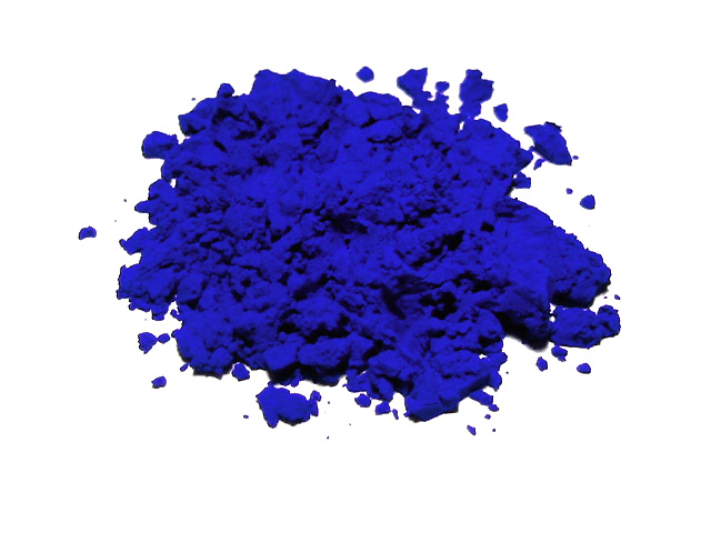
"International Klein Blue is outside the gamut of computer displays, and can therefore not be accurately portrayed on this page. However this photo of synthetic ultramarine pigment gives a fair impression of IKB as it appears in [Yves] Klein's work." (Wikipedia)